Design Overlay Zones
The following is Plan Design Xplore’s commentary on the Design Overlay Zone Amendments, currently working their way through the City process. We are glad the City has decided to take a new look at design review, since the status quo for design is not great. Unfortunately, a lot of what’s in the current draft really misses the mark. We’ve drafted a few simple, baseline design ideas that can form a foundation for harmonious design based on observation.
First, the City should conduct a visual preference survey in order to ascertain what design types the people of Portland really value. Without this basic information, it is difficult to define good design when crafting clear and objective standards.
Avant garde design is best handled through discretionary review
A harmonious built environment is more than the sum of its parts. We can allow architectural innovation while ensuring that the majority of ‘background buildings’ are making quiet contributions to the overall fabric by reinforcing established norms. When cutting edge design is integral to the development concept, it is appropriate for a project to go through the discretionary Type III Process, which uses the subjective guidelines approach.
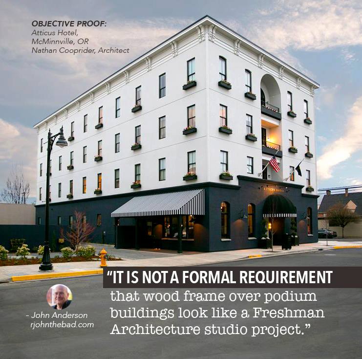
However, the majority of workaday development projects are not conceived as design-forward investments, and for them, pushing the design envelope is not critical to their success. In these cases, building design should be steered toward a baseline form that is consistent with Portland’s foundation architecture. This basic form of building has been applied consistently for centuries, and consistently appeals to most citizens.
Illustration: R. John Anderson
This basic design language requires several simple but very important considerations:
Regular window placement – Windows should be stacked vertically and of consistent size and shape.
Symmetry – facades should by horizontally symmetrical, preferably mirrored around a central vertical stack of windows.
Window aspect ratio – Windows are historically taller than they are wide. This is because of simple physics; spanning shorter distances with a lintel is easier. It also relates to the proportions of the human form, making the building relate to the scale and aspect ratio of our bodies.
No Undercuts – building walls should extend straight up from base to top (upper level step-backs are fine). Historically, buildings are formed by stacking. Cantilevers break the logic of traditional building, and create dark, unappealing streets by causing buildings to loom over pedestrians and deepening shadows in an already dark climate. (limited-width oriel bays are fine)
Vertical composition – buildings should have a very clear base, middle and top. Cornices define top. Base consists of storefront with clerestory windows and higher floor-to-ceiling height.
Minimize articulation – building wall articulation should be at a ratio of the scale of the entire facade. Indentations can provide a break in scale but should be applied to create axes of symmetry. Do not articulate every room or unit. Do not create arbitrary push/pull shapes.
Cladding material – surfaces should be smooth and consistent. Brick or stucco are preferred to metal. Do not compose facades based on increments of 4x8 sheet products.
Consistent parapets – set a datum for the parapet and do not deviate from it. A cornice, even a simple one, should be applied at the top of the highest floor’s ceiling.
Minimize number of materials on walls – differentiating base top and middle is the only reason to vary materials. Do not outline windows or add other shapes. Spandrel panels should be the same material as other wall areas.
1930 NE Alberta, constructed 2018
You can contact the City directly with feedback of your own.
Contact:
Kathryn Hartinger, DOZA Coordinator, (503) 823-9714, kathryn.hartinger@portlandoregon.gov
Correct use of articulation at building scale to break walls and define symmetry.
Illustration Laurence Qamar.


