2136 NE 15th Ave.

minneapolis4plex.jpg

Building Data:

Neighborhood: Irvington

Year Built: 1931

Typology: Minneapolis 4 Plex

Units: 5

Stories: 2+Basement

Site Area: 5,000sf

Building Area: 3,400

FAR: 0.68:1

Density: 43.5 du/net acre

Zoning: R5a (1 Dwelling/5000sf)

Parking: None

Is it Legal? No


Notes:

This lovely building on NE 15th in Irvington is the visual archetype of what we’ve nicknamed the Minneapolis Four Plex. This one has a twist though; a 600 square foot basement apartment, making this, technically, a five-plex. This building has all the hallmarks of the style; rectangular plan, with the short side facing the street, two deep units per floor, symmetrical façade composition, and Italian styling that was fashionable in the 20’s era of Euro-eclecticism.

One last word on this building. Please note the continuous expanse of stucco wall. No expansion joints (or cracks!) in sight. We seem to have lost our ability, in the building and design professions, to apply materials like this.

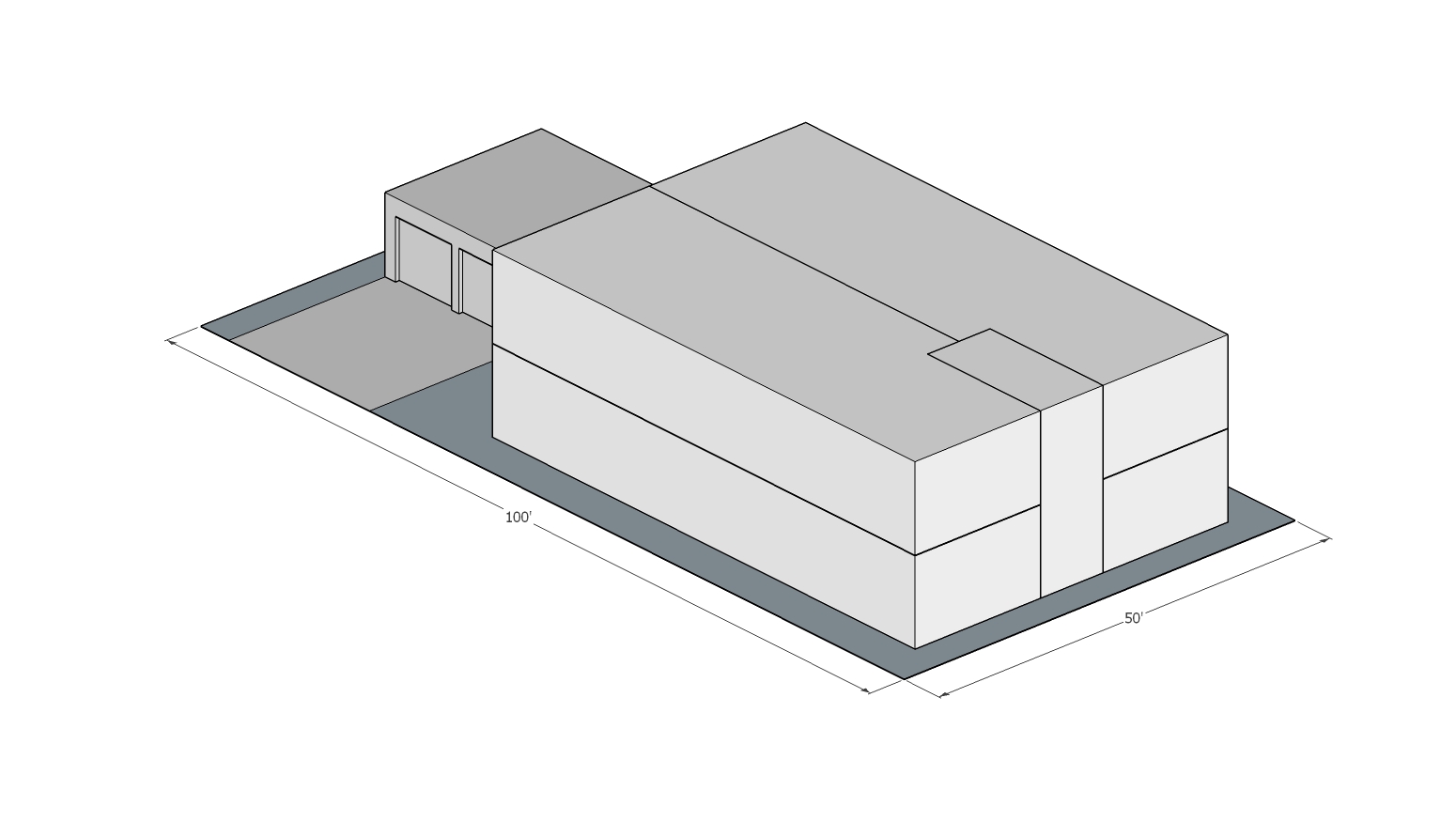
Axonometric Diagram

Axonometric Diagram

Site Plan
Site Plan


1903 NE Weidler

1903 front elevation.jpg
Building Data: Neighborhood: Sullivan’s Gulch Year Built: 1928 Typology: Minneapolis 4Plex Units: 4 Stories: 2 Site Area: 5,000sf  Building Area: 4,800sf FAR: 0.96:1 Density: 34.8 du/net acre Zoning: R2 (1 Dwelling/2,000sf) Parking: 2 off street, in…

Building Data:
Neighborhood: Sullivan’s Gulch
Year Built: 1928
Typology: Minneapolis 4Plex
Units: 4
Stories: 2
Site Area: 5,000sf
Building Area: 4,800sf
FAR: 0.96:1
Density: 34.8 du/net acre
Zoning: R2 (1 Dwelling/2,000sf)
Parking: 2 off street, in side-loaded garage
Is it Legal? NO

We’re calling this typology the Minneapolis Fourplex because it’s so prevalent there that it defines the character of many prewar neighborhoods in the same way that Triple Deckers do in Boston. These buildings can be found on corner lots and mid block sites where they work equally well. They are typically twice as deep as wide, matching the proportions of a standard residential lot. With two long, deep units per floor, they have generous plans with ample light in all rooms, and typically have a two bedroom configuration.

Facing NE

Facing NE

This is a particularly fine specimen, located at NE 19th and Weidler, in the Sullivan’s Gulch Neighborhood. Sullivan’s Gulch and neighboring Irvington have quite a few of these fourplexes and we’ll try to showcase a few in the coming weeks. 1903 Weidler could not be constructed today on this property, since it is zoned R2, which allows 2 units on a 5,000sf lot. The current zoning allows duplexes, but to construct this, you’d need either R1 zoning, or a much bigger lot.

NE 14th & Hancock

1922 NE 15th

We want to highlight this typology for its urbane, neighborhood friendly character as well as its adaptability. While this property has been converted to condo, most were constructed as, and remain, rental properties. It’s also very important to underscore the meaningful differences of form that can occur within the confines of a zone category. A zoning category that allows a fourplex on a standard lot could allow this type of building to occur, but it could just as easily allow four mini-tower type units, of the kind that have sprung up all over Seattle, where they sell for upwards of $800,000. An upzone that allows the latter would likely result in the demolition of some single family homes to make way for small-footprint single family towers with a lot of stairs.

Site Plan

Site Plan


Vista Townhouse Apartments - 912 SW Vista Ave.

Street View.jpg
Axonometric Diagram

Axonometric Diagram

Typical unit interior

Typical unit interior

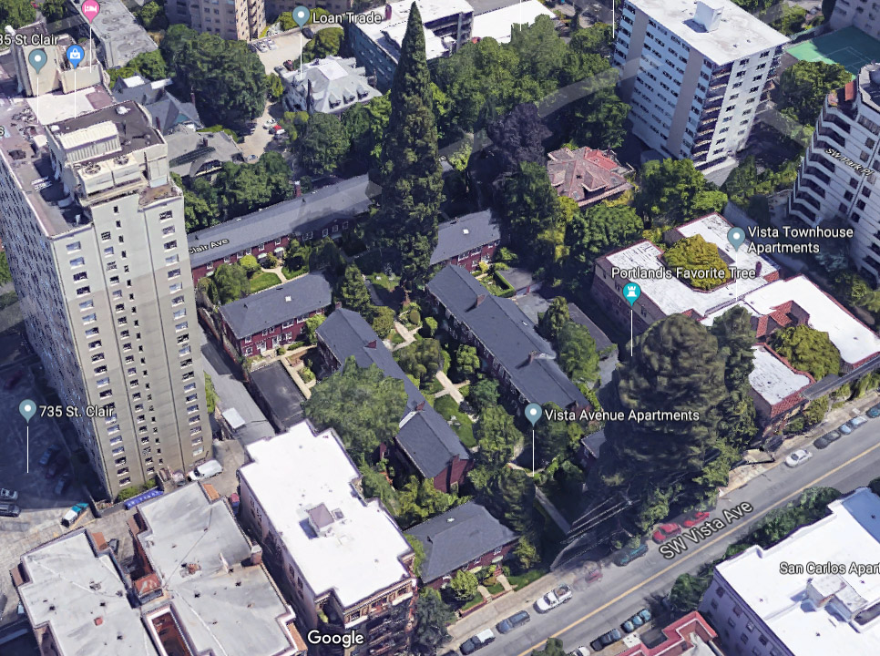
This townhouse apartment building is right next door to the Belluschi building we profiled in our last case study. It consists of two back-to-back U-shaped courtyard buildings, with an unusual arched below-grade connection to the back courtyard, which is located about 10 feet below sidewalk grade. The site slopes away from Vista Ave, allowing this unique configuration.

Building Data:
Neighborhood: Goose Hollow
Year Built: 1931
Typology: Courtyard Townhouse
Units: 22
Stories: 2 + Basement
Site Area: 15,000sf, 0.34ac
Building Area: 21,282
FAR: 1.42:1
Density: 64 du/net acre
Zoning: RH (High Density Residential)
Off Street Parking? None
Is it Legal? Yes

The units are two bedroom, two story townhouses, averaging about 720 square feet. There are 22 total units; 10 townhomes in each courtyard, and two basement flats (they are daylight basements, made possible by the sloping site). The building is tastefully rendered in the Euro-eclectic vernacular that was popular in the 1920s, with a brick base, stucco upper floor, clay tile mansard (the primary roof is flat) and leaded glass windows. Our only complaint about this design is that due to the aspect ratio of the courtyards and the large trees that fill them, the units are rather dark.

Courtyard.jpg

Aerial Axon

Aerial Axon

Site Plan.jpg


Vista Avenue Apartments: 800-864 SW Vista Ave.

1.jpg
Building Data: Neighborhood: Goose Hollow Year Built: 1942 Typology: Hybrid Court – townhouse and stacked flat Units: 42 (12 flat, 30 TH) Stories: 2 + Basement Site Area: 60,000sf 1.38ac Building Area: 40,648 (+20,324 private basement area) FAR: 0.6…

Building Data:
Neighborhood: Goose Hollow
Year Built: 1942
Typology: Hybrid Court – townhouse and stacked flat
Units: 42 (12 flat, 30 TH)
Stories: 2 + Basement
Site Area: 60,000sf 1.38ac
Building Area: 40,648 (+20,324 private basement area)
FAR: 0.67:1
Density: 30.5 du/net acre
Zoning: RH (High Density Residential)
Off Street Parking? 30 Private Garages
Is it Legal? Yes

Notes:

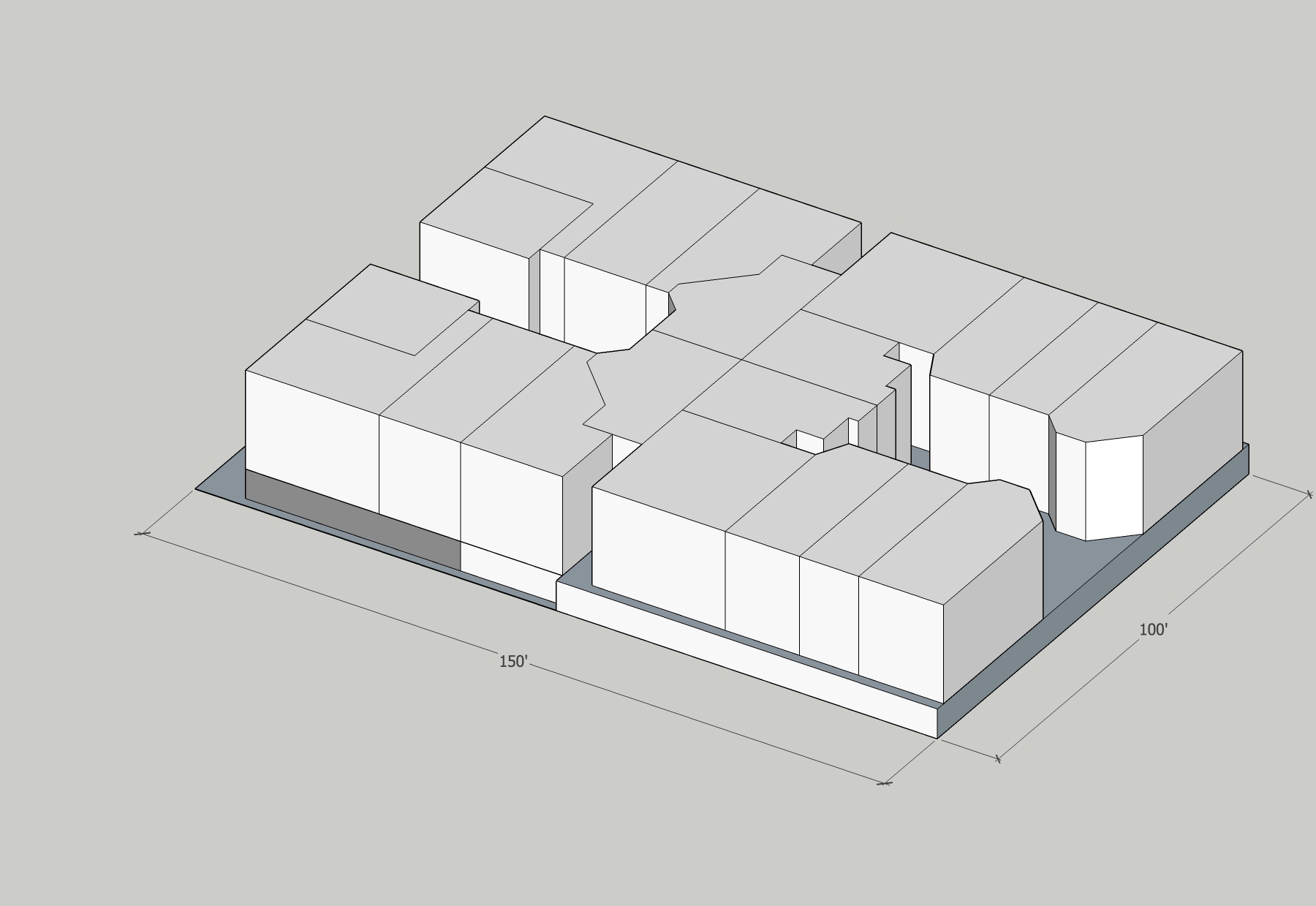
This apartment project was designed by Portland’s best known 20th century architect Pietro Belluschi. The project is situated on a large parcel (measuring 200’ x 300’) in the Goose Hollow neighborhood. The site consists of seven residential buildings and four detached garage structures arranged around a central courtyard. There are 30 townhouse units, 12 stacked flats. The latter are divided between the three largest buildings, and located at the middle of each bar. The flats are in groups of four arranged around a shared stair lobby, and flanked by townhouse units on either side.

Facing west from courtyard

Facing west from courtyard

The site slopes away from the street and from the north side to the south side, which creates novel and picturesque conditions, belying the symmetry of the plan. The buildings to the north site lower than their southern counterparts, creating an impression of asymmetry. This is enhanced by landscaping, which includes both lawns and intimate seating areas, and several very large sequoias and rhododendrons.

Courtyard landscaping and seating

Courtyard landscaping and seating

All the townhouse units feature private basements and many have working fireplaces. Additionally, garages are kept out of sight. Rows of garages sit behind the buildings that flank the courtyard, and orient toward drives (the northern one is a stub street and the southern is a private driveway. Their impact on the site is minimized by depressing them such that the garage roofs are roughly level with the ground plane on which the buildings’ main levels sit. Another row of garages is located in the basement of the longest building which lines the back of the site. The garages face SW St. Claire Ave.

Street view rear, SW Yamhill & St. Claire.

Street view rear, SW Yamhill & St. Claire.

Aerial Axon

Aerial Axon

Site plan

Site plan


1106-1114 SE Lincoln St.

Building Data: Neighborhood: Hosford-Abernethy Year Built: 2017 Typology: Townhouse, styled to look like Walk-up Apartment Building Units: 6 Stories: 3 Site Area: 2,850sf Building Area: 6,090 FAR: 2.14:1 Density: 91.7 du/net acre Zoning: RX (Central…

Building Data:
Neighborhood: Hosford-Abernethy
Year Built: 2017
Typology: Townhouse, styled to look like Walk-up Apartment Building
Units: 6
Stories: 3
Site Area: 2,850sf
Building Area: 6,090
FAR: 2.14:1
Density: 91.7 du/net acre
Zoning: RX (Central Residential)
Off Street Parking? None
Is it Legal? Yes

Notes:

Just west of Ladd’s Addition, we discovered this fascinating recent addition to the neighborhood. This little project shows what a little attention to proportion and form can do. This building takes a form common to pre-war multifamily housing, a U-shaped building with to wings and an entry court. Unlike a typical apartment building in this format, this project is a somewhat unorthodox configuration; six three-story townhouses.

The façade material is the mundane material, EIFS, a foam and stucco cladding system we typically associate with suburban strip malls. Here it’s used to great effect, including a nice offset around the windows, giving them a depth not usually found in contemporary construction. We located a great precedent about a block away, showing historic context for this design.

Breakdown of how a good façade is composed

Breakdown of how a good façade is composed

The subject property “Before”

The subject property “Before”

We particularly appreciate this building because of its sensitivity to its surroundings and its careful application of classical proportions. While composed in the form of a well-established typology, the building also exhibits a clear hierarchy of base middle and top. It is symmetrically composed, and its windows are roughly twice as high as they are wide. On the block face, the building’s cornice is roughly in line with the roof heights of surrounding structures. The building achieves a very high net density because it is on a very small lot. At roughly 50x57, the lot is about half the size of a standard Portland residential parcel. We uncovered a “before” photo from the City, showing the property before this building was constructed. The lot appears to have been chiseled off from a neighboring property, creating a new half-lot.

Nice window detail, unfortunate PGE meter placement.

Nice window detail, unfortunate PGE meter placement.

Formal-factor compatibility with surrounding context

Formal-factor compatibility with surrounding context

Neighboring Historical Precedent

Neighboring Historical Precedent

Site Plan

Site Plan


2413-17 SE Division

IMG_2004.jpg
Site Data (just the 5000sf containing the two new structures) Building Area: Building 1 (Front) 4500sf Building 2 (Rear) 1800sf Neighborhood: Hosford-Abernethy Year Built: 2014 (per Assessor data, actual phasing unknown) Typology: side-by-side townh…

Site Data (just the 5000sf containing the two new structures)
Building Area:
Building 1 (Front) 4500sf
Building 2 (Rear) 1800sf
Neighborhood: Hosford-Abernethy
Year Built: 2014 (per Assessor data, actual phasing unknown)
Typology: side-by-side townhouse/rowhouse
Units: 5 (3 in phase I, 2 in phase II)
Stories: 2
Site Area: 5000sf
Building Area: 6300sf
FAR: 1.26:1
Height: 2 stories, 25’ approx.
Density:
Phase I Triplex – 26.1 du/ac
Triplex + Phase II Duplex 43.6du/ac
Whole Site:29.0du/ac
Parking: on-street
Zoning: R-1 (1du/1000sf)
Is it legal? Yes

2413-2417 SE Division provides a lovely modern example for a traditional two story row house similar to what you would find in historic English and northeastern U.S. neighborhoods. Unlike many of its contemporary cousin townhouse designs, this building has been freed from the design constraints imposed by the addition of garages. This allows the structure to better blend into a neighborhood primarily constructed before the mass use of the automobile, and also allocates more street parking on a busy commercial corridor rather than limiting public parking due to curb cuts for private garages.

Phase II duplex behind primary structure

Phase II duplex behind primary structure

The project originated with the historical duplex located on the NE corner of SE 24th and Division, expanding to the neighboring lot with three forward facing townhouse units, with the later addition of two more townhouse units behind the first three. The living space of the units is not floating above a garage, allowing the living space to have a real relationship to the ground plane and the street. This relationship allows the building to blend into the existing fabric of the block - its sidewalks and other buildings, rather than floating 10 feet above everything else. Lots this close into the center of the city are well covered by public transit, and historically have not been designed around parking, this is a great place for garage-free design.

Unlike many contemporary examples, this building does not fear symmetry and uses a tried and true approach to building design. You have simple clean lines creating clear definitions between the units, windows that line up, solid choice of quality build materials. We would love to see more of this in the future.


Land + Construction + Time

Land + Construction + Time

2417 SE Division.png