In our last post we dived in to the patterns of land division that characterize most prewar North American cities, particularly those on the west coast. Now it’s time to explore (or… XPLORE) how these forms can be used create great places, and how we can use these lessons to build good buildings communities moving forward.
As we showed previously, blocks have an end grain, consisting of the long sides of rectangular lots, and a side grain, which comprises the short ends of that series of rectangles, facing the street mid-block.
The block is typically rectangular, and it has a nested hierarchy of lots of similar dimensional ratios nested within it. This fractal relationship tells us something valuable about how to orient buildings on lots.
Corners are unique because they allow us to take that fractal relationship a little further by dividing again into a smaller module. Of course, there are other ways to divide land, and we’ll examine these, and their attendant problems in subsequent posts. For now, we’d like to explore the unique properties of corners to understand why and how we can use them to their full advantage when looking for opportunities to add context-sensitive density to our urban neighborhoods.
So what’s so special about corners? It all comes down to access to the public room, the street. Let’s examine what that looks like.
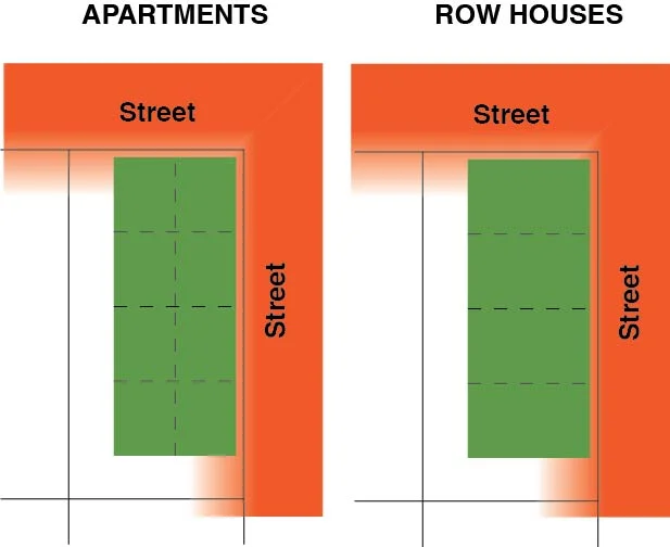
Would you rather live on the street facing end, or on the side? There’s no accounting for preferences, and a few people will have their reasons for choosing to live facing a glorified light-well, but for the most part, people tend to prefer light and air. In fact studies have found that views of nature have quantifiable social and mental health benefits.
Therefore, when siting new multifamily structures, we can take advantage of the fractal nature of block and lot division to site corner buildings to maximize the access to light, air and views.
Orienting a building so that the long side of the lot faces the street allows us to treat that lot line like a mini version of a full-scale block face.
Trying to insert these same building typologies mid block creates a less desirable condition, since the majority of the space inside these buildings has considerably less direct access to air and daylight.
Again, this is not to say it can’t be done, if Portland wants to be judicious and surgical about how it inserts density into its existing urban fabric, corners seem like a no-brainer. Clearly people can and do build this way, but if we’re talking about up-zoning portions of already built-out neighborhoods, why not do so in a way that is minimally invasive and follows a logical pattern that is legible with in the existing neighborhood’s spatial hierarchy?
The additional linear curb frontage also mitigates the parking problems associated with dense infill; corner lots typically have room for up to six vehicles to park along the curb. Our case studies have found many great examples of this.


