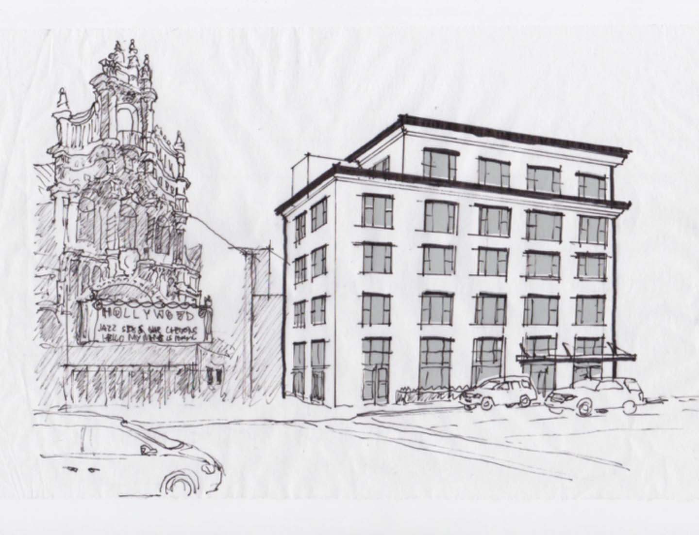
This building is badly deformed. It has pointless flanges and ribbons, to make it more “interesting.” The flange on the right makes a “C”. C is for “clusterfuck.”
Let’s see if we can’t rationalize this a bit.
Using a simple, time-honored scheme of proportions, traditional widow forms and strong cornice line, this blobby mess of arbitrary forms now looks clean and elegant. It doesn’t compete with the glam-rococo forms of the theater!
Note that it’s not ornamentation we're going after here. The lavish blingy forms of the theater are true to their historical precedents and have a rigor that makes them rational, whether you love them or hate them. They follow rules of order, symmetry, hierarchy and proportion. Now the apartment building also follows some well-established rules rather than screaming for attention with arbitrary, tacked-on shapes that have nothing to do with the structure of what’s going on inside it. So much better!


