
When we started this project, the authors of this blog came together around a simple question: would Portland be more supportive of new development if the quality of that development were better? From there, we began our exploration of what people like/dislike, and what are the elements of "Old Portland" design that people like and how can we reverse-engineer them. The flip-side of this proposition is an investigation of the common complaints with contemporary building practice. We need to understand precisely what people dislike most in contemporary design and figure out how to avoid the most common problems. One bad building is not a problem, but the cumulative effect of many is a blight that's already looking dated before the paint is even dry. We can't allow the public conversation around Portland's future to descend to a zero-sum game where we must choose between a city we can afford and a city we love - we can do better!

Gimmicky facade treatment on N. Williams

Danish Dwellings - no flanges here.

Roman Palazzo
A lot of our objections address trends toward superficial gimmicks that are presumably intended to make monolithic facades seem more interesting or create a simulacrum of granularity (pretending the block is more diverse when in reality, it's just one huge structure). Large buildings with fairly simple, straight forward facades can be quite elegant and beautiful when proportioned and clad properly. We've been building like this for a very long time, as these examples from Rome and Copehnagen Demonstrate:

Buildings with such odd deformities resemble creatures exposed to a toxic ooze, with haphazard placement of familiar elements. These elements have no tectonic meaning (tectonics describes the way a building's shape supports its volume and how its parts connect to one another).

Arbitrary facade manipulations sprout like tumors from walls like tumors.

lol, wut?
Perhaps the worst offender we've noticed to date is The Linden, at the intersection of Sandy/Burnside/SE 12th. It was designed by an out-of-town firm and sports a particularly egregious example of "the ribbon," a particularly silly and pointless architectural meme from the last decade.
This pointless flange traces around bits of the facade like the snake game found on old Nokia phones.

I missed the bus playing this game once.
Here's the design in action: start with a fairly ordinary box, start tracing a snake around arbitrary bits of the facade, throw on a "pop" color, then use Sketchup's push/pull tool on some parts of the facade,

These things kinda design themselves

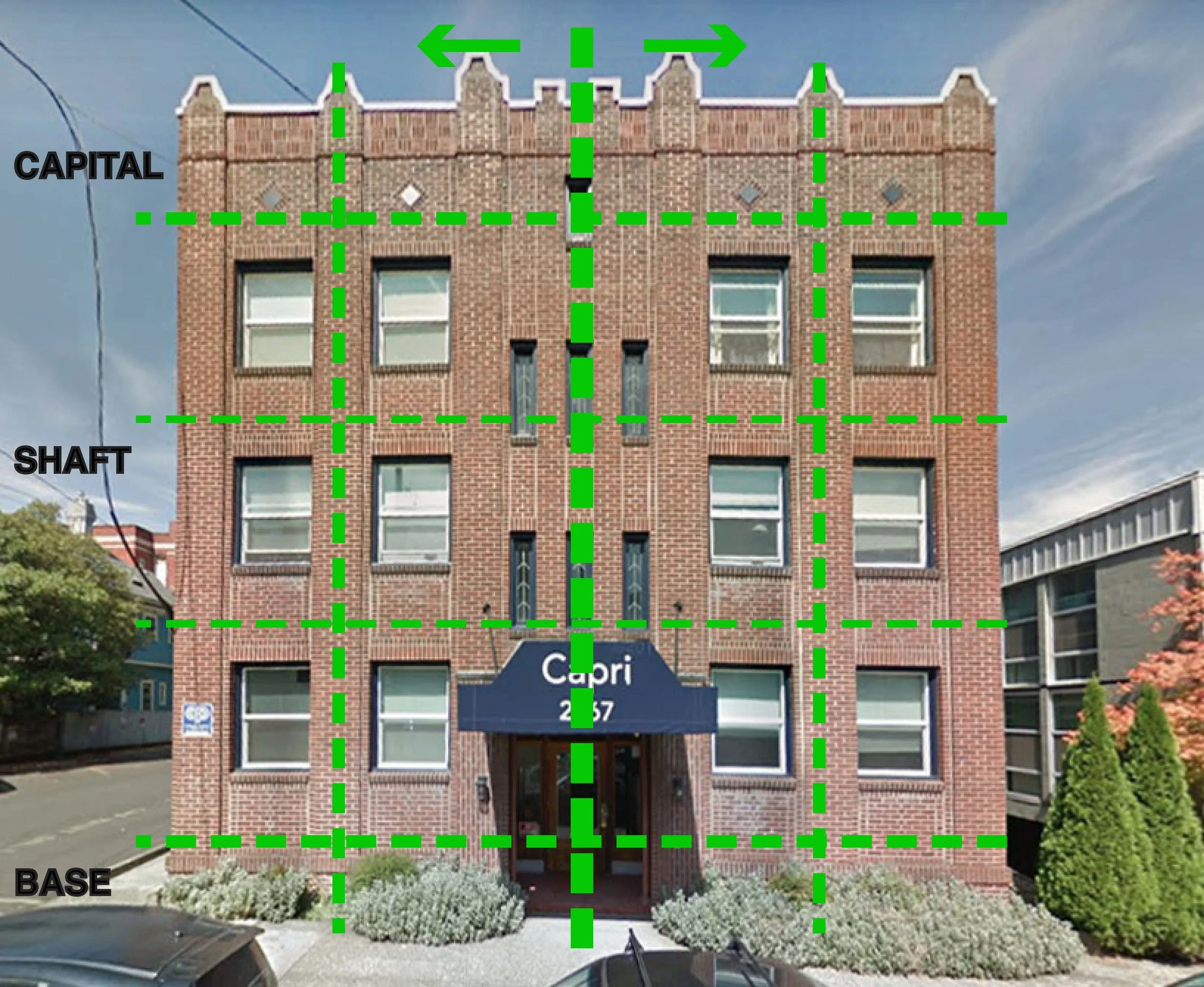
Until quite recently, our middle scale buildings didn't go around screaming "fire" in crowded theaters. Following are a few examples we've seen around inner NE and SE. These buildings are pretty good neighbors and rely on symetry, proportion and a time-tested cannon of vernacular forms that please the eye, because they relate to human proportions and communicate pretty clearly what the building is about.

Let's break one of these down into its constituent elements to see how traditional facade composition works. The top/middle/bottom relate in architectural language to the segments of a column. These bits, and the symmetrical composition, relate to the general head/torso/legs of a human body, and the repetitive elements are scaled in proportion to human beings.
By contrast a lot of contemporary projects seem incredibly arbitrary in their facade design. Sometimes it's the result of a desire to make a boring building interesting and other times (or both) it may stem from designing the plan with out regard for how it will look in three dimensions - the internal arrangement of rooms dictates the way the building looks on the outside, with bizarre, unpredictable results. Sometimes it seems the decision making progress seems like it might have been "why did you put that door there?" "We had to put it somewhere, so we put it there."

Why tho?
It doesn't have to be this way. We can find just as many examples of architects relying on some pretty basic principles of design to make buildings that, in 100 years or so, people may just want to preserve.

Tess O'Brien Apartments by FFA Architects, between NW Overton & Pettygrove
Rendering of proposed buildings in Northwest Portland

1727 NW Hoyt, by Carleton Hart
Of course, you can go full modern and do something innovative if you've got the chops for it. There are some really talented designers working in Portland who definitely do. But for the rest, we implore them to just keep it simple.

A fine contemporary building on SE Division by Works Progress Architects

3775 SE Belmont, by Surround Architecture.
Here's a great building on SE Belmont that uses a fairly modernist palette, while remaining squarely within the traditional schema for medium size apartment buildings. Note the strong bilateral symmetry and vertical segmentation. A rusticated base anchors the building and it has a nice clear termination at the parapet. Nothing to ambitious, but it embodies one of Mies' axioms, "I'd rather be boring than bad" or something to that effect. There's something to be said for quiet, understated competence.
Now every man, woman and mutant can know the truth about De-Evolution.