There’s a perennial debate in the design and planning world about what kinds of standards are appropriate for new development in a historic context. Should new buildings blend in, or stand in contrast? Is it “phony” or “context-sensitive”to replicate historic vernacular forms?
This post is the result of a conversation with city staff regarding Portland’s Conservation Districts. Over the course of the conversation, while trying to articulate what I thought was most important about compatibility and integration of new buildings with existing fabric, I hit upon the phrase “Diagramatic Compatibility.” This idea really connected because it stands in contrast with other conventional notions of compatibility, and gets at a deeper level of design than the (literal) superficial matching of materials, colors, etc. that some codes prescribe.
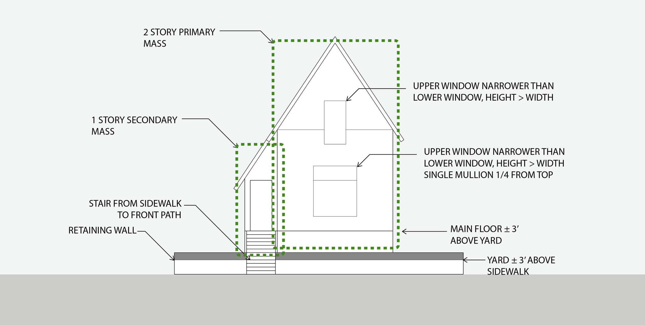
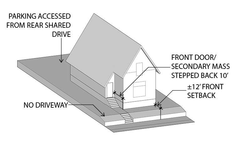
Diagramatic compatibility can be defined as matching the key schematic elements of composition for a block or district. It includes approximate massing, proportions, overall height and setback lines, relationship of the building to the street, to its site, and the rhythm of buildings along the street in relation to one another. This is distinct from the particular vernacular style of the building (Queen Anne, Tudor, Craftsman, Prairie Style, Streamline Moderne, etc.).The latter refers to the particular visual language of a building, while the former refers more to what it’s saying in a given language.
Often a new building is neither stylistically nor diagramatically compatible, in which case it’s easy to be confused about why it feels like a bad fit. My argument is that diagramatic compatibility is far more important than stylistic compatibility.
New construction in the Boise Neighborhood
It is my contention that a house or building that is stylistically dissimilar yet diagrammatically compatible is far more appropriate and responsive to its urban context than one that is nominally of the same style while exhibiting a very different configuration, massing, relationship to site, etc.
Queen Anne Victorians and a contemporary addition, 23rd Ave. Seattle
This row of Queen Anne Victorians in Seattle’s Central District was joined by a new neighbor fairly recently. As you can see, the newcomer is composed in a completely different idiom, yet it continues the rhythm of the row of houses that came before it.
Simplified elevations
What matters here is the overall proportion of the building, its pattern and placement of windows and doors, it’s overall form factor, and its relationship to the site and to the street.
What “historical” typology is this?
By comparison, this new addition to the Boise neighborhood at NE Fremont & Rodney is at least nominally compatible, in as much as it is composed in a “historical” vernacular. However, something about it just doesn’t look right. That’s because its particular configuration, large house with the main floor elevated above the ground plane on top of a two car garage, with a wide driveway taking the place of a lawn and stoop, is something that doesn’t have any historical precedent. It’s an entirely new configuration, dating to within my lifetime. There are a few early 20th century houses that have basement garages, but they remain subordinated to traditional site arrangement principles.
Finally, I’d argue that vernacular ways of building, which are sometimes referred to as “historical” are not anachronisms at all. They are still perfectly valid ways of building. Existing examples constructed in pre-war vernacular are highly functional and beloved by their residents.
James Duthie House, 1728 SE Belmont
I personally resided in one of Portland’s oldest houses, the James Duthie house. The house has been partitioned into a triplex with upper, ground floor and basement units. I lived in the upper unit. I found it both convenient and enjoyable (not to mention spiritually uplifting to experience continuity with generations of residents reaching back to the Lincoln administration).
Carlton Landing, Oklahoma
This recent courtyard townhouse project Carlton Landing in Oklahoma was brought to our attention by our esteemed friend and incremental development advocate/coach R John Anderson. It demonstrates that contemporary buildings with a vernacular design vocabulary aren’t necessarily “fake history” - they’re just good, carefully detailed, thoughtfully designed buildings. There’s absolutely nothing obsolete about the overall composition or architectural expression here. Most importantly, the diagrammatic form of the building is entirely consistent with the Prewar, non-autocentric forms we advocate here at Plan Design Xplore.


