Infill

Lloyd District Reboot

Photo by u/pnwmommy on Reddit

We decided to take a look at a possible future, for Portland’s perpetually undead Dead Mall, the Lloyd Center. A lot of proposals have been put forward, some serious, some silly. It’s our frank assesment that the mall itself has outlived its useful lifespan, and the opportunity cost of trying to repurpose the structure is just too high. What we mean is, it could be adapted for some other use, but by doing so, we foreclose all the other possibilities that arise from demolishing it, and the missed opportunity is worth more than any efficiency from keeping the carcass on life support for another generation. You know the phrase, ‘leaving money on the table,’ in reference to a deal where you don’t get all you could for something. Well, in this case, the ‘money’ is housing where it’s needed most, and a great urban neighborhood, where there’s underused relic of mid 20th century car culture and consumerism.

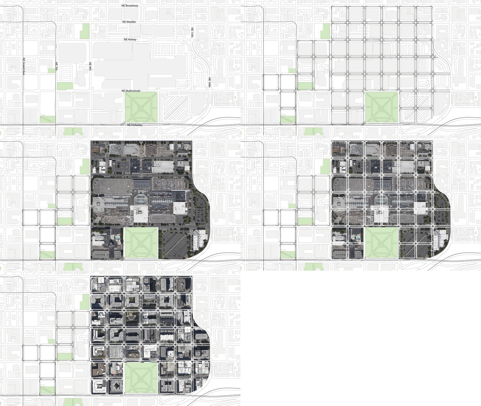
Existing mall and vicinity

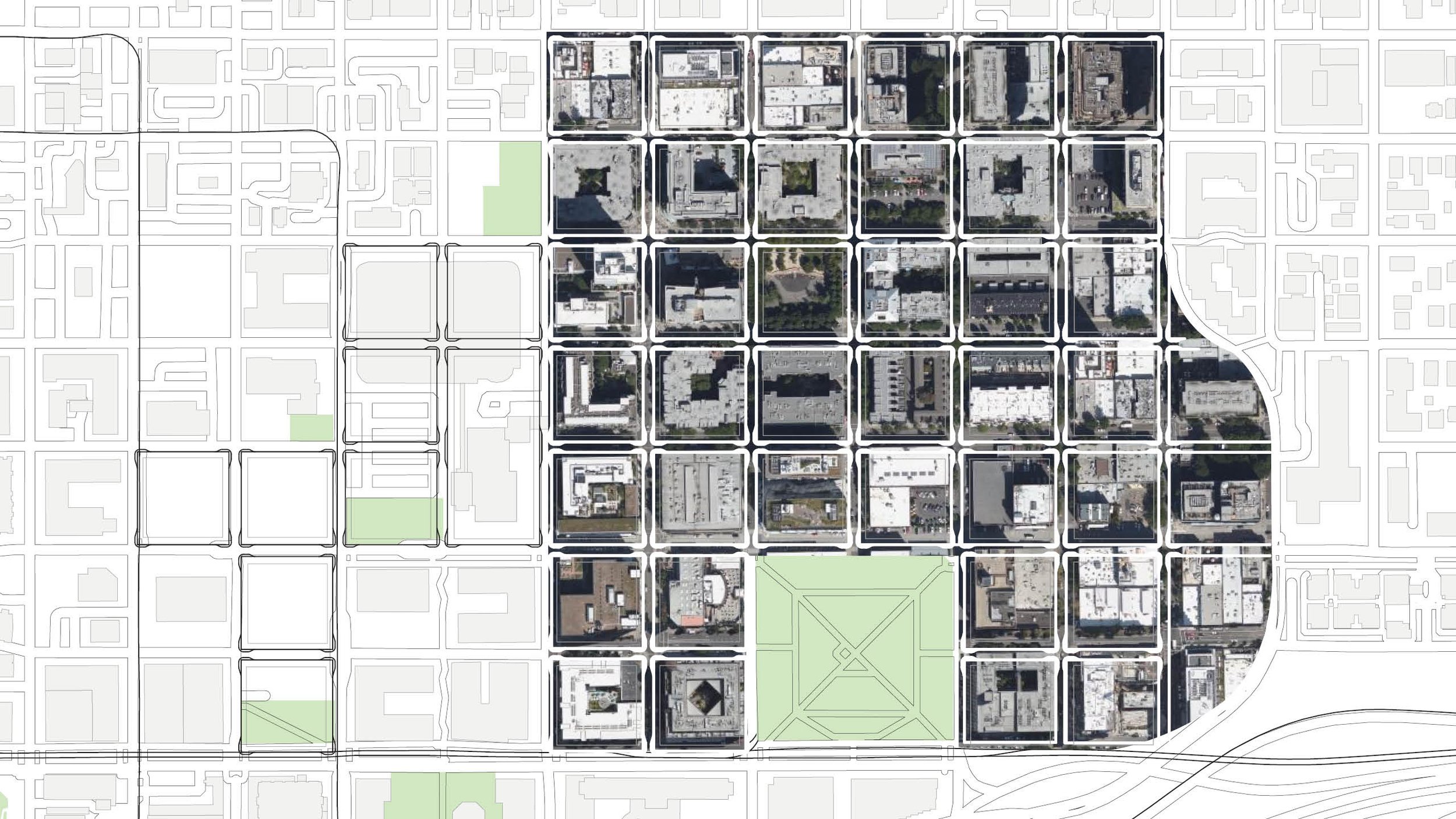
We didn’t come up with any wild ideas here, or even particularly exciting ones. This is a sort of baseline capacity study, to see what, at a minimum, could be achieved if the city grid grew back where it once was, and the blocks filled in with midrise development appropriate for a central city location adjacent to downtown and high capacity transit.

Here’s the existing development pattern. Note how out of scale the footprints are with the surrounding urban neighborhood. This is big pixel, low resolution urbanism.

But if the street grid were to heal over the wound, there’d be some major opportunities for a granular, walkable neighborhood to grow.

Finally, we grabbed an aerial of the equivalent number of blocks from the Pearl and dropped them in. The shift in scale is stunning.

These blocks, representing the core of the mall and its immediate vicinity could make a significant dent in our housing shortfall. If the area were to follow the development pattern of the Pearl District, averaging around 200 dwelling units per acre, it could easily accomodate 7,000 new apartments, and become home to somewhere upwards of 11,000 people! If the pattern were extended west towards I-5 those numbers could be doubled, and all this could be accomplished without the sacrifice of any historic buildings or residential displacement (the handful of existing apartments near Broadway and Weidler would not need to go).

I was in the right place, but it musta' been the wrong time...

Juxtaposed.jpg

Here’s a case of two recent residential infill projects that neatly demonstrates several flaws in the way we think about plan for new middle scale buildings.

5 row angle.jpg

Case 1 is located about 100’ east of MLK Jr. Blvd. On paper, this building is doing what middle scale zoning should – providing a step-down transition between the midrise apartment zone (which happens to contain a brand new 5 story apartment building in this case) and the single family homes to the east. To be honest, it’s not even failing at that task per se. We like this building for a number of reasons. Its vernacular profile and consistent and calm architecture is timeless and skillfully executed. It presents a symmetrical, legible front to the street, and does not go through odd contortions to accommodate garages. It comprises five identical row houses in a line perpendicular to the street. The only complaint here is that this bread loaf loads its slices from doors facing the long side, which is an interior lot line. We’ll have more to say on this in a bit…

5 row .jpg

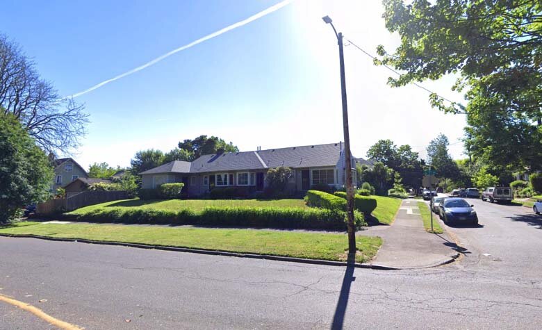
Our other case, located about 500 feet east, is on a corner site, with the outer side lot line facing Irving park. There’s not much positive to say about the architecture here.


duplex.jpg

This mess of arbitrary shapes and pointless rectangles is configured as a side-by-side. The building itself is extremely awkward. It’s three stories tower over its bungalow neighbors, due to the fact that its ground level is dominated by garages. This is one of those buildings were parking dominates and living space is shoehorned in around it. The two units suffer from the “floor is lava” problem, where the main living space is far enough from the yard that they have minimal connection to it. Unsurprisingly, the yard is just a patch of beauty bark surrounded by a 6’ “privacy fence,” Interspersed with posts that support stairs and decks for the levitating house above.

Beauty Bark.jpg

The gist of this post is that zoning orthodoxy instructs planners to put the “most intensive uses” along arterial streets, where there is high traffic (car and foot) and frequent transit. So far so good. The logic fails when we look at what this really produces. Broad brush zoning application doesn’t take things like Irving Park into account. Nor does it do much to relate bulk and height to the supposed intensity of a use, which, in residential areas, is simply measured in terms of number of units.

Wouldn’t it make more sense to have the taller of these two buildings between homes and mid-rise apartment blocks? Wouldn’t it make more sense for the side entry building to be on a lot where those entries can face the street, or better yet, a street with a big park on the other side? There’s precedent for the latter only a couple blocks away! Here’s a bungalow-bar type fourplex facing Irving park, with its entries facing the long side of its corner lot. How hard is this to figure out? The precedent is right fucking there, 200 feet away!

Precedent.jpg

The big idea behind form-based codes is that the form factor of the building is more important than the internal configuration, since that determines compatibility.

5 row doors.jpg

This nice row of front doors seems kind of wasted here. Wouldn’t it be better to have these lined up facing Irving Park across NE 7th? Compare:

duplex vs 5plex 1.jpg
duplex vs 5plex 2.jpg

Diagrammatic Compatibility

west elevations tinted linework.jpg

There’s a perennial debate in the  design and planning world about what kinds of standards are appropriate for new development in a historic context. Should new buildings blend in, or stand in contrast? Is it “phony” or “context-sensitive”to replicate historic vernacular forms?

This post is the result of a conversation with city staff regarding Portland’s Conservation Districts. Over the course of the conversation, while trying to articulate what I thought was most important about compatibility and integration of new buildings with existing fabric, I hit upon the phrase “Diagramatic Compatibility.” This idea really connected because it stands in contrast with other conventional notions of compatibility, and gets at a deeper level of design than the (literal) superficial matching of materials, colors, etc. that some codes prescribe.


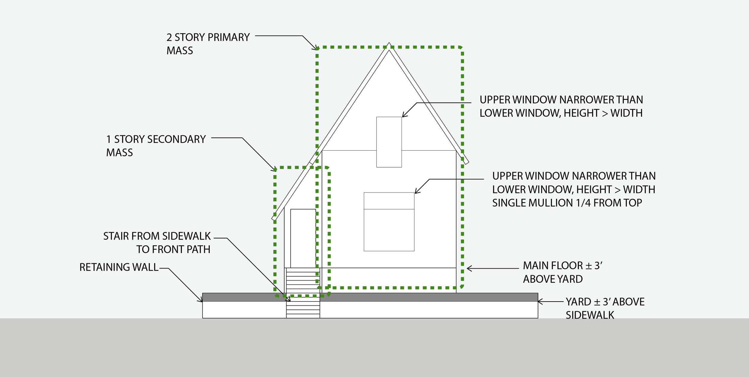
Diagramatic compatibility can be defined as matching the key schematic elements of composition for a block or district. It includes approximate massing, proportions, overall height and setback lines, relationship of the building to the street, to its site, and the rhythm of buildings along the street in relation to one another. This is distinct from the particular vernacular style of the building (Queen Anne, Tudor, Craftsman, Prairie Style, Streamline Moderne, etc.).The latter refers to the particular visual language of a building, while the former refers more to what it’s saying in a given language.


Often a new building is neither stylistically nor diagramatically compatible, in which case it’s easy to be confused about why it feels like a bad fit. My argument is that diagramatic compatibility is far more important than stylistic compatibility.

New construction in the Boise Neighborhood

New construction in the Boise Neighborhood


It is my contention that a house or building that is stylistically dissimilar yet diagrammatically compatible is far more appropriate and responsive to its urban context than one that is nominally of the same style while exhibiting a very different configuration, massing, relationship to site, etc.

23rd & Columbia1.jpg
Queen Anne Victorians and a contemporary addition, 23rd Ave. Seattle

Queen Anne Victorians and a contemporary addition, 23rd Ave. Seattle

This row of Queen Anne Victorians in Seattle’s Central District was joined by a new neighbor fairly recently. As you can see, the newcomer is composed in a completely different idiom, yet it continues the rhythm of the row of houses that came before it.

Simplified elevations

Simplified elevations

victorian elevation annotated.jpg
contemporary elevation annotated.jpg


victorian axon annotated.jpg
contemporary axon annotated.jpg

What matters here is the overall proportion of the building, its pattern and placement of windows and doors, it’s overall form factor, and its relationship to the site and to the street.

What “historical” typology is this?

What “historical” typology is this?

By comparison, this new addition to the Boise neighborhood at NE Fremont & Rodney is at least nominally compatible, in as much as it is composed in a “historical” vernacular. However, something about it just doesn’t look right. That’s because its particular configuration, large house with the main floor elevated above the ground plane on top of a two car garage, with a wide driveway taking the place of a lawn and stoop, is something that doesn’t have any historical precedent. It’s an entirely new configuration, dating to within my lifetime. There are a few early 20th century houses that have basement garages, but they remain subordinated to traditional site arrangement principles.

Finally, I’d argue that vernacular ways of building, which are sometimes referred to as “historical” are not anachronisms at all. They are still perfectly valid ways of building. Existing examples constructed in pre-war vernacular are highly functional and beloved by their residents.

James Duthie House, 1728 SE Belmont

James Duthie House, 1728 SE Belmont

I personally resided in one of Portland’s oldest houses, the James Duthie house. The house has been partitioned into a triplex with upper, ground floor and basement units. I lived in the upper unit. I found it both convenient and enjoyable (not to mention spiritually uplifting to experience continuity with generations of residents reaching back to the Lincoln administration).

Carlton Landing, Oklahoma

Carlton Landing, Oklahoma

This recent courtyard townhouse project Carlton Landing in Oklahoma was brought to our attention by our esteemed friend and incremental development advocate/coach R John Anderson. It demonstrates that contemporary buildings with a vernacular design vocabulary aren’t necessarily “fake history” - they’re just good, carefully detailed, thoughtfully designed buildings. There’s absolutely nothing obsolete about the overall composition or architectural expression here. Most importantly, the diagrammatic form of the building is entirely consistent with the Prewar, non-autocentric forms we advocate here at Plan Design Xplore.