infill

ReUrbanist Collaborative’s Irvington Dynamic Density Workshop

On a chilly Saturday in February a couple dozen neighbors gathered for a hypothetical experiment in community-led planning, under the auspices of a project called Dynamic Density, created by the team from ReUrbanist Collaborative - architect Rick Potestio and urban designer Jonathan Konkol (me).

What is Dynamic Density?

Dynamic Density was conceived as a tool for neighborhoods to use to allocate new housing in a context-sensitive way that benefits the community and offers a degree of control over the design of buildings. We have observed that many of Portland’s densest, and most desirable neighborhoods are a jumbled up mixture of single family houses, large buildings, and everything in between. Examples of this are Kings Hill, where Rick lives, the southern half of Irvington, where I live, and other places like Sullivan’s Gulch, Buckman, the Alphabet District, and others. These places took shape before modern zoning was established. 

Under our system, neighborhoods would assess the existing blocks and buildings in their community and decide what buildings, trees, businesses etc. are extremely valuable to residents, and should be off-limits to demolition and redevelopment. The second part asks neighborhoods to find places for a specified number of new homes - each community’s share of anticipated growth - by allocating building types on the remaining properties. In order to ensure compatibility of the new housing with the existing neighborhood context, we provide a menu of pre-WWII multifamily buildings we have compiled from walking Portland neighborhoods with our cameras and tape measures. 

Why do we need to do this?

As most people are aware, Portland, like all west coast cities, suffers from an acute housing shortage, which has driven the cost of renting or buying a home out of reach of many people. As construction has not kept up with a growing population, people forced out of the housing market have ended up on the streets, creating a crisis that threatens livability for everyone. 

Meanwhile, Portland, once a success story for progressive planning, has been unable, or unwilling to do the hard work of planning how it will grow in the last couple decades, and now we’re dealing with the consequences. We have pushed new housing construction out to the edge of our urban growth boundary, into places that are nearly impossible to serve efficiently with transit, and congestion has consequently become an ever increasing problem. The governor and legislature have responded with blunt instruments that may have some short term benefits, but I believe, are profoundly short sighted and destructive; attempts to override our urban growth boundaries, and lifting development restrictions on existing neighborhoods without any attempt to preserve the qualities that made people want to live there in the first place. 

To be clear, the city as a whole is very low density and should accommodate many new, larger buildings. However, the planners’ approach does not address architecture or preservation at all, perhaps because it’s just too much work! We can do both, but it requires more sophisticated tools than our government is using. Dynamic Density is the tool we’ve developed to solve this problem.

Speaking strictly for my own motivations, I have put countless hours into this project over the past five years out of a desire to find the best way to balance the competing imperatives to expand the amount of housing while sacrificing as few historic buildings as possible and without sacrificing the look and feel of our historic neighborhoods. From my experience studying and practicing architecture and planning, almost all NIMBYism is a perfectly natural reaction to the rubbish the architecture profession has generated in my lifetime. There are always good examples to be found, but at a gross level, people are right to be anxious about the quality of design to be expected of a new building, when an old one is knocked down to make way for something new. People, by and large, react to things that look ugly and cheap, and that is what my profession has been pumping out. 

What happened at the workshop?

We divided the participants into three groups, all with 600 dwelling units worth of legos. Each group had a somewhat different task thought; each group had a different combination of bricks, representing different types of multifamily buildings. 

Team 1 was given mostly small buildings: duplexes, four-plexes and 8-plexes. Team 2 got a selection of medium density building types: four-plexes, eight plexes, brickers and a few L-shapes. The third team got a bag containing several towers, some L-shapes, and a few brickers. In many ways, the low density team had the most difficult task. They had by far the most buildings to find homes for on the map. By contrast, the high density team had far fewer decisions to make, though they may have been difficult ones. With the fewest buildings to place, they didn’t need to worry nearly as much as the other teams about what would have to be demolished to place their 600 units on the map. We also told this team that the lots fronting Broadway are off limits, as we’re anticipating new legislation will likely be aimed squarely at parcels with residential zoning, and Broadway is already zoned for 6-8 stories. In a more rigorous version of this exercise, we’d have placed this restriction on all the teams, but as it turned out most people intuitively understood that it would make no financial sense to place duplexes and fourplexes in locations where most such buildings have already long since given way to more lucrative commercial buildings and apartments, and zoned for more. 

Lessons Learned

This was a lesson in trade-offs. The approaches to growth posited by our three team scenarios offer a spectrum of alternatives, and selecting the right one for a given community entails balancing that community’s priorities. One can minimize changes in the scale of buildings - their bulk and height, or, one can minimize demolitions of existing buildings by keeping the footprint of change small and going up. Mathematically, one cannot do both. My personal bias is to preserve as many historic buildings as possible, so I prefer an approach that uses a few tall buildings, placed with some intentionality, to make room for new residents without sacrificing the non-renewable resource of historic buildings. Your preferences may vary, but the Dynamic Density approach offers us the tools to come to the best compromise we can manage, and to do so in an informed, democratic way. 

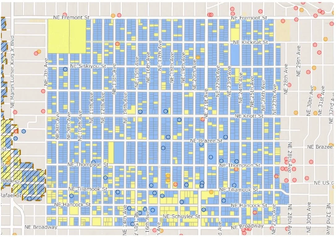
Irvington Historic District: Blue sites are contributing, yellow are non-contributing

The maps we used included color coding for the Irvington Historic District, indicating which buildings were classified as ‘contributing structures’ versus ‘non-contributing’ structures. This made it easy for teams to assess which buildings were of less historic and architectural significance. All teams generally opted to pick the low hanging fruit, preferring to sacrifice non-contributing buildings for denser new buildings to accommodate growth. We think this reflects a basic value most people place on historic buildings that define the fundamental look and feel of a neighborhood. In neighborhoods without such mapping tools already at hand, an exercise like this would likely need begin with teams of people fanning out into the streets with clipboards, and engaging in a process of developing their own list of contributing versus non-contributing structures. 

The low density team realized that market economics made their scenario least plausible. The combination of high land costs with low yield per site meant that duplexes and fourplex buildings would have to command very high prices just to break even. Therefore, in a high-value, close-in neighborhood like Irvington, that sort of upzoning would likely result in few new units being added. Moreover, the low density team’s challenge most closely resembles the direction in which state and local legislation is pushing us, and indicating that the current legislative agenda is probably not going to deliver the units promised. With that information, we can surmise that for most communities, some mixture of medium and high-density infill will be the most successful path to realizing our housing targets. This has the added advantage of preserving more existing structures, and limiting the disruption of the urban fabric. The outstanding question is how much height communities are willing to accept, when the alternative is greater numbers of structures demolished and redeveloped. 

The tour visits existing fourplexes in Irvington

We also noted that there are problems that need to be solved with the way Oregon’s building codes regulate ‘missing middle’ housing. Under Oregon’s version of the International Building Code, any residential building with more than two units must comply with commercial code standards (as opposed to the residential code) which requires costly features like fire sprinklers and greater separation between units. This adds a lot of cost to a fourplex or a sixplex, and that cost is often enough to make smaller historical multifamily building types not financially viable to construct. This will require changes at the state level, and that will have to come from the legislature. 

Finally, and perhaps most significantly, the workshop demonstrated that the stereotype of single family homeowners, and those residing in historic districts, in particular, are knee-jerk NIMBYs who refuse to accept any change and disdain dwellers of multifamily housing is a lazy generalization that doesn’t reflect reality. As one of my mentors has said, “When given good information, communities will always make the right choices.” 

In my observation, people generally seem to react with skepticism if not outright fear of new development in their communities because they’ve been conditioned by the bad design my profession has foisted upon them for decades. People love the quality of the architecture and the feel of the streetscape in the neighborhoods where they have chosen to live. They are perfectly happy having neighbors in the pre-auto era multifamily buildings that have existed in Portland neighborhoods for over a century. If we can offer people tools to preserve the architectural heritage of their communities, benefit from growth and have a modicum of control over how it will look, they will make the right choice. 

 People understood the physical implications of different types of housing and also debated the economic and social aspects. If this were a real-life exercise, I am confident that highly considered and sound decisions would be made. The walking tour was very instructive in pointing out the very different and important characteristics of buildings that in policy terms are identical. The fact that garden court apartments and parking lot apartments can be seen as similar to a bureaucrat, but so different to a neighborhood’s character and social structure is a very significant realization for most people.  - Rick Potestio

I went to the meeting hopeful, but not sure that the project would be successful. Sometimes it is nice to be wrong.  The people who participated took the matter seriously and thoughtfully, and I thought "Yes indeed, this could work, and for sure it is a better system that the top-down zoning code regulations that are the standard in the United States. - Tony Greiner

The opportunity—and challenge—of density is all in the question of HOW it is done. Proponents of density cite examples of it being done well, and opponents cite examples of it done poorly. When cherry-picking examples, both sides are right—and wrong—and we get nowhere as a community. So, it’s incredibly important to move the matter of density from an abstract question to a specific one. What kind of housing? Where? For whom? How? This is what makes the difference from density being done well versus poorly, and this is what the exercise allowed us to do. Down to the individual plot and unit level we were thinking about how the system could evolve to map to our communities needs in specific, clear ways. It’s the kind of exercise that will help anyone who cares about community development and urban planning, and I’m grateful to Jonathan and Rick for making it happen, and the Irvington Community Association for promoting it, and the wonderful attendees for bringing their full selves to make the session a success.  - Caleb Bushner

Background Buildings 101

One of the lessons we’ve been attempting to illustrate with this blog is that good growth in cities, and evolution of neighborhoods works best when designs respect context and don’t try to stand out with short-lived trendy design cliches. We belive that most nimbyism is a natural reaction to conditioning of the public by the architectural profession to expect architectural atrocities when a new project goes up. It doesn’t have to be this way.

Background buildings are calm, quiet buildings that do their thing without screaming for attention - or yell fire in a crowded theater. What makes a city interesting is not a collection of novelty buildings with outrageous shapes, it’s the way the parts fit together and relate to the connective public space to make a harmonious whole.

We’re going to break down the basic elements of composition for a timeless, competent background building mid-rise multifamily building. A building that compliments its surroundings, rather than tries to one-up them with silly gimmicks.

One of the great things about the sort of timeless design we practiced until the postwar era is that it’s scalable. The basic way of composing a facade applies equally well on a single story or a 12 story building.

scalability

Overall Best Practices::

  • Timeless forms that avoid ‘fast fashion’ trendy design themes

  • Quiet background buildings that don’t scream for attention

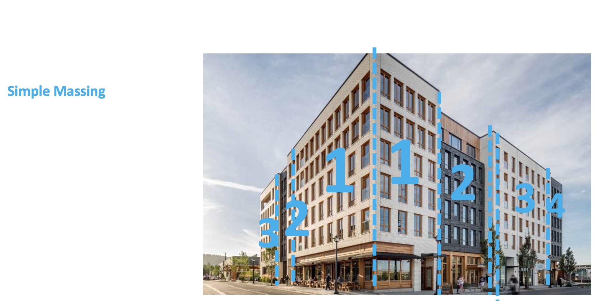
  • Simple massing that doesn’t try to replicate a city skyline in a single structure

  • Uniform application of quality cladding material such as brick

What we need to avoid:

Arbitrary Shapes

Overhangs & undercuts that create a topheavy appearance and dark spaces at street level.

Attempting to recreate an entire city skyline in one building. WTF is going on here? Way to many materials, way too many shapes.

So let’s break down the elements of composition and look at some examples.

  • Simple, Tripartite Facade

  • Base/Middle/Top

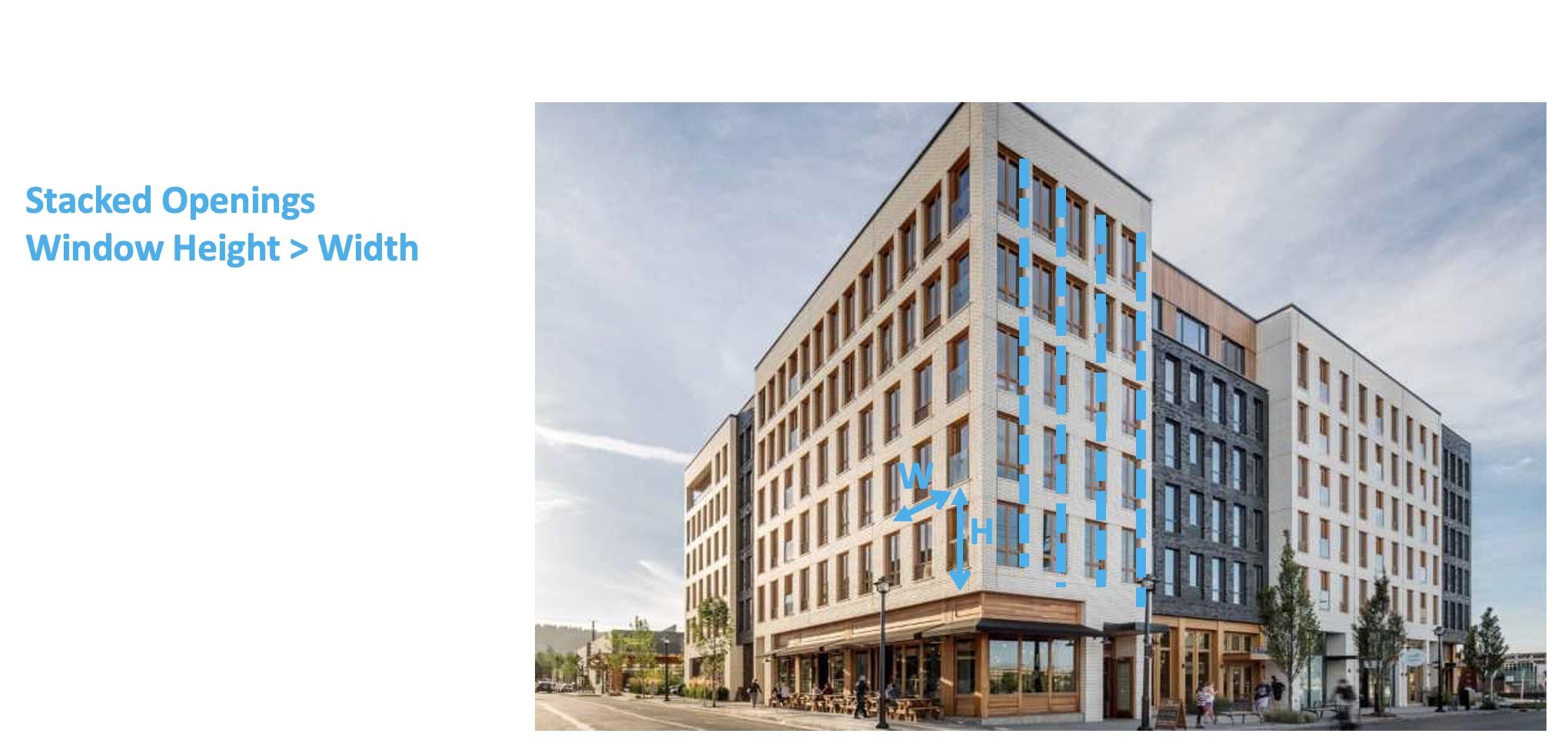
  • Vertically Aligned Openings

  • Window Height>Width

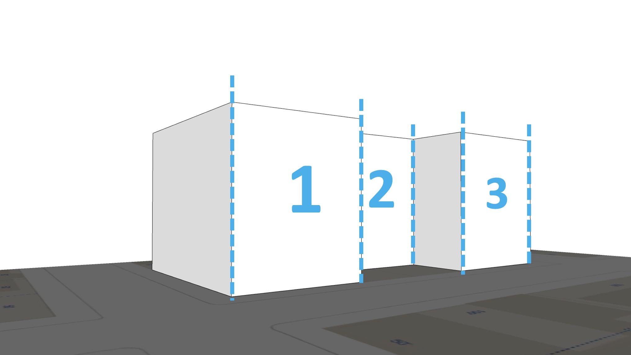
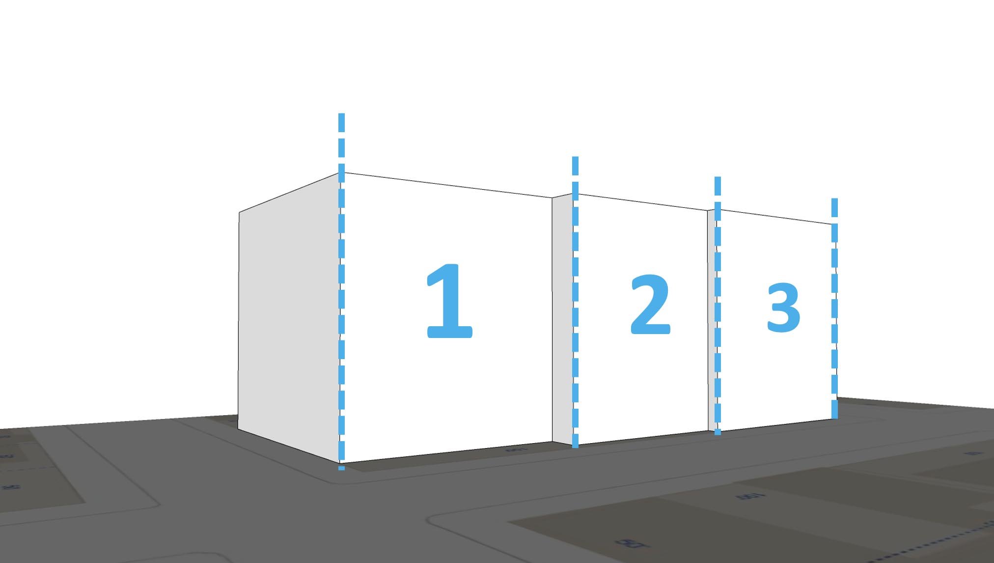
The rule of thirds in building composition can be found at least as far back as Vitruvius. The gist of it is that if you’re going to insert breaks in form and plane, it’s best to do it so that the building is basically divided into three primary masses. Further, each element on a facade should be about a third of the size of the bigger element it’s nested in, so a bay should be about a third of the wall plane it’s attached to, and so forth. Here’s three examples of how you could break horizontal articulation into three segments:

Vertical composition, similarly, has three elements, a base, a middle and a top. Think of a column; it’s got a base, a shaft and a capital. Likewise with the human body, so there’s an anthropomorphic element if you like.

Bands and cornices are a straightforward way of accomplishing this. You can also do it with changes in materials and/or colors.

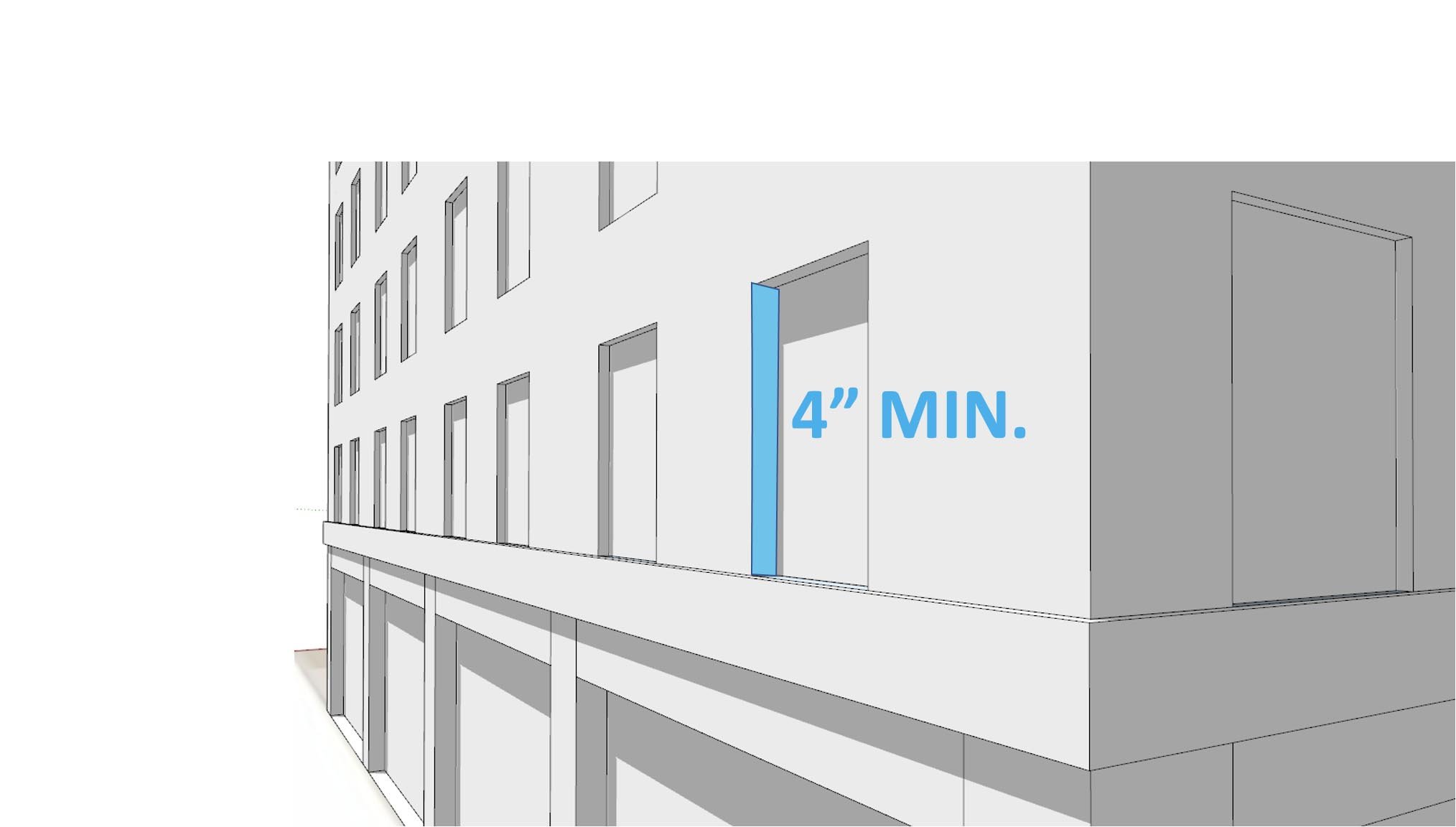
Have you ever noticed that modern windows make a building look cheap and insubstantial? This is because a common type, the nail flange window, is installed so that the glass is flush with the outside wall plane. Traditionally, windows are inset somewhat from the surface of the wall, allowing us to see the depth of the wall. The more thickness we can see, the sturdier the wall looks. Lots of contemporary buildings look like they’re only an inch or two thick.

The aspect ratio of the windows is important. Windows should be taller than they are high. There are good reasons why we expect this. It’s easier to span a short distance than a long one, so the narrower the window, the sense it makes structurally. Intuitively, we all know this. There is, once again, the anthropomorphic element too: we’re taller than we are wide, and a 6 foot high by 3 foot wide window gives us a sense of scale: when we look at a wall and see a pattern of objects that roughly scale to ourselves, we can easily read the size and proportion of the building.

And finally, the windows should be aligned vertically. Once again, this has to do with gravity. The load of a building transfers on to the floor or wall below, and you wouldn’t stack a wall of bricks over an opening. We understand this intuitively, so checkerboard window patterns seem off somehow. “Random” or “arbitrary” placement of facade features has been something of a fad in the early 21st century, but there’s little reason to expect it to have much staying power, and every reason to expect it will soon look as dated and foolish as the other trends we’ve mocked on this blog.


Here’s what you get when you put all these elements together:

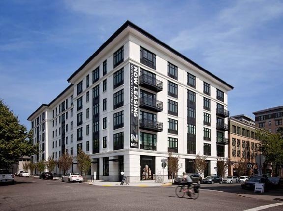
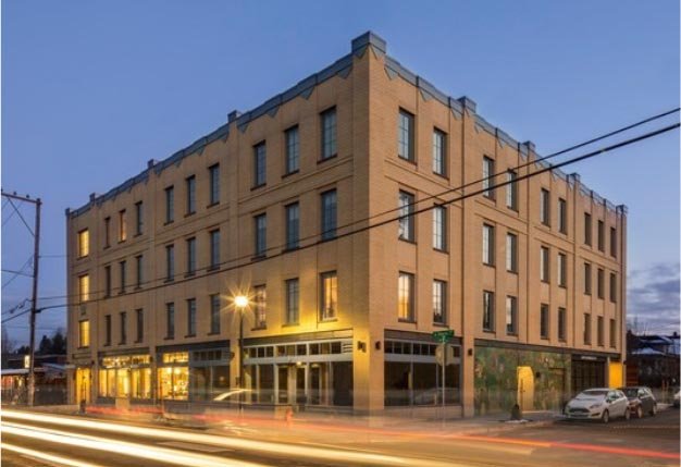
But don’t take our word for it. Here are some examples from recently completed buildings in Portland. This one is located in St. Johns. It does all the right things: stacked windows that are taller than wide. Three primary masses, a base, a middle and a top. One primary material on each mass. We could do with more of this.

This example, the LL Hawkins building in Northwest is a lot bigger, but follows the same rules.

Let's break it down into the elements we've been looking at:

And as a reminder that these elements are not expensive, and in fact don’t impact the cost of building in any way, let’s observe the same elements on a recently constructed affordable housing structure in the Eliot neighborhood, the Songbird, on N Vancouver.

There are plenty more good examples to be found around town. Here’s one made with the cheapest of materials, EIFS, a material than is often associated with tacky strip malls and Taco Bells. Just follow a few basic rules of composition, and voila, it looks great. This building in Goose Hollow is a timeless, classic asset to the neighborhood.

And a few more from around town…

And lest we forget, here’s a reminder of what some of today’s architects might try, for the sake of ‘creating visual interest’ or ‘breaking up the box.’

Golf Courses and Green Spaces

watercolor.jpg

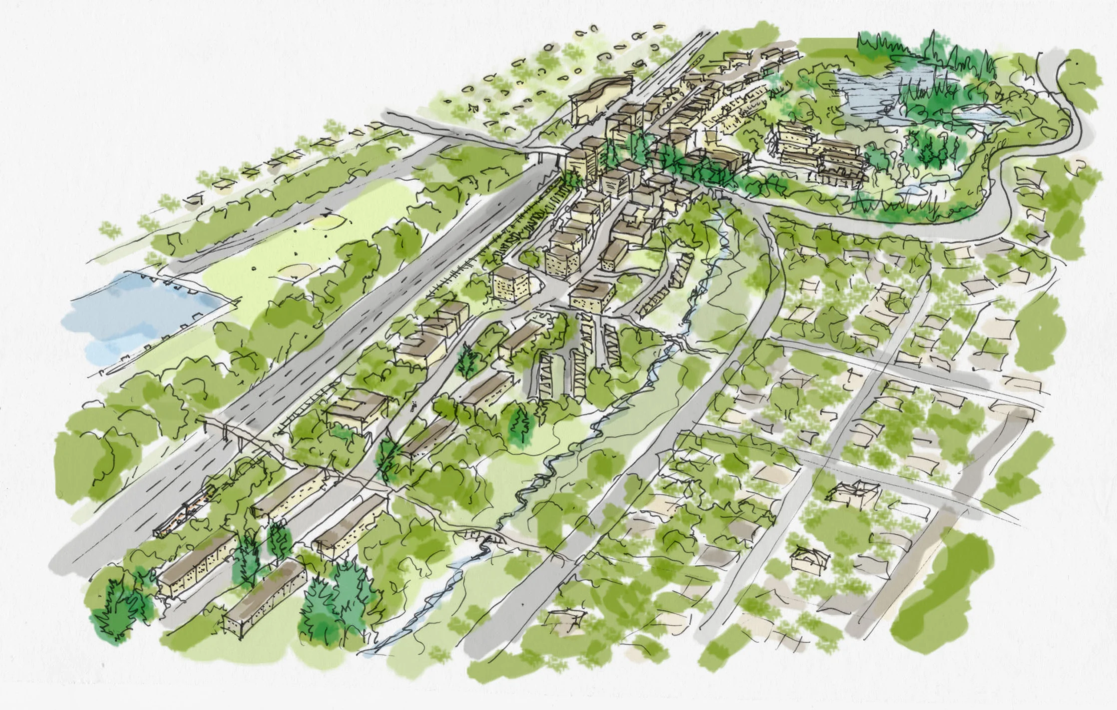
Over the last week, news stories in The Oregonian and the Portland Tribune have raised the issue of Portland’s public golf courses’ financial insolvency. It so happens that we’ve been mulling over the idea of redeveloping these properties for some time. As golf declines in popularity, redevelopment is becoming increasingly attractive to cities nationwide.

All else being equal, we’d rather not see these places change. But larger forces are gathering and so we’re putting this proposal out there to frame the inevitable discussion around the things we believe are necessary to preserve livability: visual continuity, public ownership, tree preservation, public green space, and of course, beauty.
20160526_aerial_final_less.jpg

Just looking at the numbers, it’s tempting to take a maximum density approach and pack as many units as physically possible onto these sites. However we believe that a city designed by spreadsheet is not a city we want to live in. We have to recognize the value of the beauty these spaces hold and the wonderful break from the grid of the city. The open space of these courses also offers opportunities for multiple forms of active recreation, from cycle-cross to running, to adventure parks with climbing and zip line courses like this one we found while exploring Potsdam, near Berlin.

2km13yqyhj8g2fib.jpg

Golf courses can also provide valuable ecological services including hosting pollinators and native plants and absorbing storm water. The 80 acre Oregon Garden occupies a former golf course near Silverton, and now boasts an extensive landscape garden as well as providing a home for Oregon’s only Frank Lloyd Wright building, the Gordon House.

It should look the same as it does today.
We should keep (almost) every tree.
The land must be publicly owned.
Board2.jpg

A plan for redeveloping Portland’s golf course properties would have to balance the need for additional housing with the other benefits the open space can provide to the community at large. We took the Eastmoreland Golf Course for a test case. It’s adjacent to two light rail stations, and thus a good candidate for additional housing units. As one of us is a Reed alumnus, we’re sensitive to the neighborhood’s attachments to the open space and the beauty of the site, as well as how it enhances the surrounding community, and our design takes that into account. We think this plan, or something similar, if accepted, is worth a guarantee to the neighborhood that it can stay single family in perpetuity (with ADUs, of course) and place a permanent moratorium on demolitions. Quid pro quo is only fair. We’re completely sympathetic with neighborhood concerns and this would be entirely consistent with our general approach of balancing preservation with strategic infilling where appropriate.

The municipal courses, are of course, publicly owned, and we believe the land should stay publicly owned. The city can allow development on parcels created in the property with 99 year ground leases. The thing about land is, they’re not making any more of it, and the city should not just sell it off out of expediency.

Board1.jpg

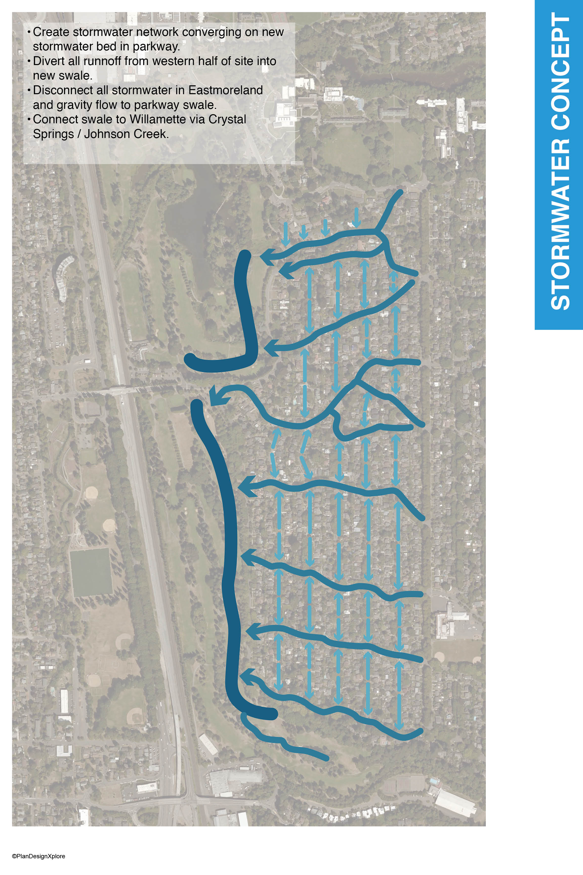
The design aims to maximize housing opportunity while providing publicly accessible green spaces, maintaining and enhancing the parkway character of SE 28th, minimizing negative impacts to surrounding neighborhoods and providing natural storm water management for the site and adjacent community. We began by establishing a parkway about 280’ wide along the existing eastern edge. This matches the block dimensions of the neighborhood to the east. This area would be completely free of development and would include trails and amenities. It would also provide drainage from the western portion of the site which gets very wet in the winter. Visually the experience of SE 28th should be unchanged from how it appears today.

Board5.jpg

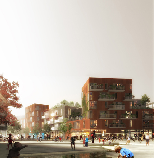
Taking this concept further, we envision diverting all the uphill storm water from the neighborhood into a seasonal swale or creek running the length of this parkway and connecting to the existing crystal springs creek. Our design prioritizes tree preservation, placing all development in existing fairways. We envision an extensive bike/ped network through the site including two new bike/ped crossings over McLaughlin Blvd. Finally, we’ve provided a suggestion about the architecture, favoring a quiet, subdued Scandinavian aesthetic resembling the neighborhoods we found around Copenhagen and Malmö. Finally, we would not touch the Crystal Springs Rhododendron garden, which is a true treasure to the whole region.

Board4.jpg
2n8rnmfi19zkf46b.jpg
Board6.jpg
We set out to achieve a high level of density, aiming for 40 dwelling units per acre.

We set out to achieve a high level of density, aiming for 40 dwelling units per acre.

Target Density.jpg

And here’s where we ended up:

Achieved Density.jpg

Given some time and budget, we’d love to develop this into a REAL concept. That would entail a few sample block drawings and some street sections, indicating how pedestrians and cyclists would experience the neighborhood. We’d also like to flesh out the program for public amenities and the incorporation of housing at a wide range of price points, including fully subsidized units. We will try to return to this in a future post, as time permits. For now, consider this a conversation starter and an overture to a dialogue on the future of this public resource.

The precedent: This is the kind of development Danes build in their station areas.

The precedent: This is the kind of development Danes build in their station areas.

We’ve gone as far as some rough modeling of how typical blocks could work. Here are a few examples of how the bits should work together:

A typical transect adjacent to the station

A typical transect adjacent to the station

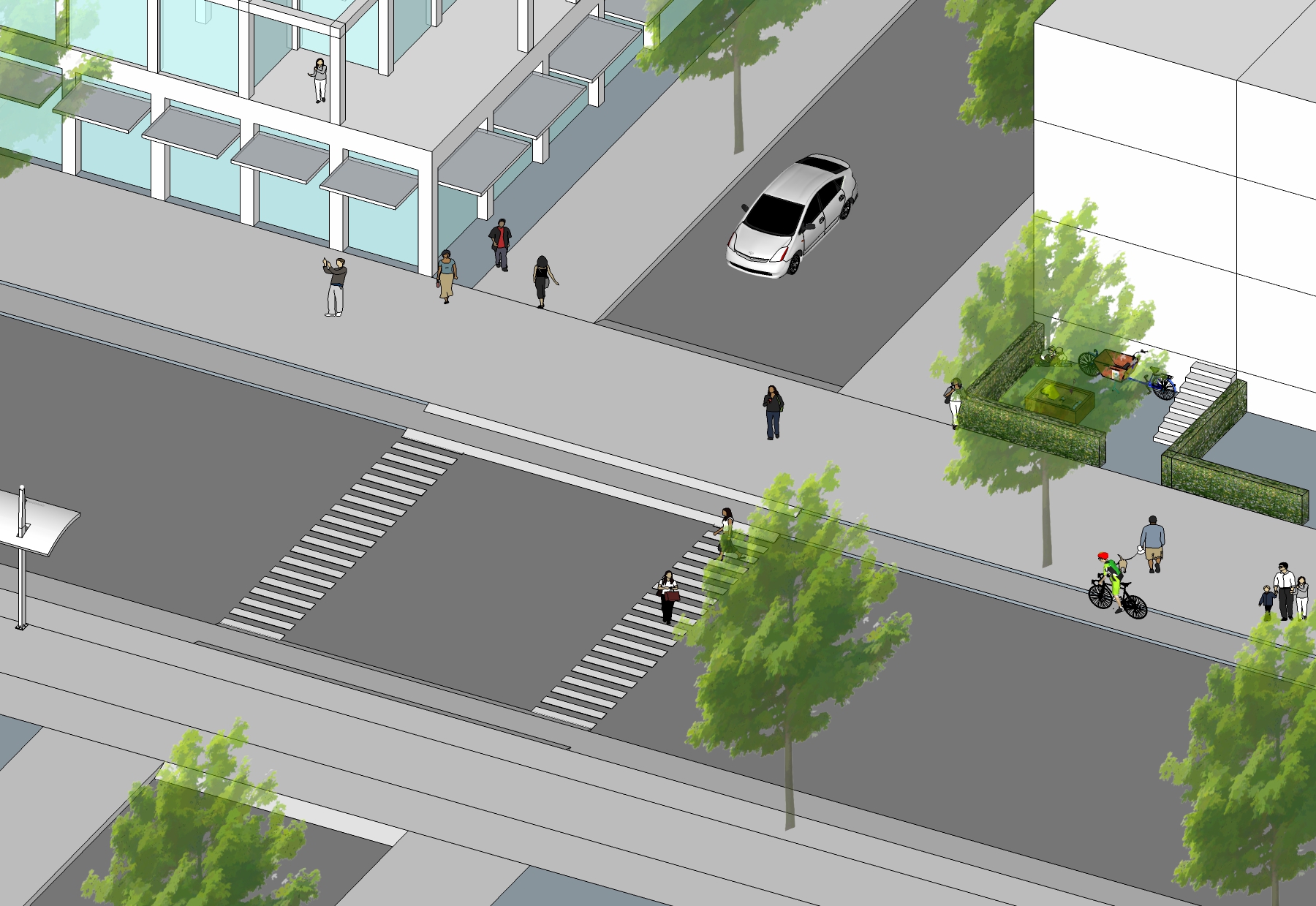
Sidewalks are continuous on main streets. Bikes are separated from traffic. Drivers on intersecting streets must tiptoe through the bike and ped realms.

Sidewalks are continuous on main streets. Bikes are separated from traffic. Drivers on intersecting streets must tiptoe through the bike and ped realms.

Grade separated bike lanes, mid block crossings and on street parking for the mixed use areas and main north-south routes.

Grade separated bike lanes, mid block crossings and on street parking for the mixed use areas and main north-south routes.

Plan view of a typical street in this zone

Plan view of a typical street in this zone

Intersection Axon.jpg
mid block crossing.jpg
Block 1 Axon.jpg
Front Yards.jpg
block 3 axon axon.jpg

Taking one more cue from the Danes, we’d like to see places like this include features that make them complete neighborhoods like the ones we saw around station areas in Copenhagen. That means including daycare, supportive housing for people with mental mental health and developmental disabilities, and subsidized housing for people with low incomes or fixed incomes (i.e. elderly pensioners). All these things fit seamlessly into those communities and made them truly inclusive places.

Tallboys, The Floor is Lava, and Other Consequences of Parking

This is the beginning of what will be an occasional series on the design impacts of parking on urban housing. Let's start with a look at what we'll call the "tallboy" - referencing those 16 ounce cans of cheap beer or malt liquor, for when 12oz just isn't enough. Here's one, under construction in NE Portland. 

 16oz of residential pleasure


16oz of residential pleasure

Distorted proportions represent distorted priorities

Distorted proportions represent distorted priorities

The stretched proportions of the tallboy houses are a parody of the archetype of the house. We generally share an ideal image of a house, and it's reflected in the homes we've built for ages. The image of "house" is has a loose canon of proportions, neither too high, nor too wide, and we can observe this in a walk around our neighborhoods. As a rule, the height is generally less than twice the width, or the width is never more than twice the height. 

Oblong

Oblong

The archetype, with its infinite variations, is the monopoly house. 

The universal signifier for "house"

The universal signifier for "house"

Beyond the cognitive distress of these funhouse mirror distortions of basic form, there are some real urban design impacts to consider. These impacts are eminently quantifiable too. Let's examine the traditional relationship of dwelling to public realm. Streets are more than just a network of routes from place to place; they are public spaces. Streets are the negative space between private spaces, where civic life, life between buildings happens. The sidewalk is where public meets private. In traditional neighborhood design, there is a sophisticated gradient mediating between public and private space. This gradient is defined by both horizontal and vertical separation. The distances involved do not need to be huge to be effective either, as we will see below. 

public-private.jpg

The 21st century spec townhouse eliminates this gradient however, isolating the dwelling behind what is basically a small parking lot. The pedestrian experience is degraded to a stroll past the ass end of a row of luxury SUVs in more than a few projects we've observed. 

Parkinghouse.jpg
Normal 2D.jpg

The traditional neighborhood design, with its graduated layers of privacy is based on the way the building relates to its site. The ground plane, shown here, is the plane that the building sits on. The way the building relates to this plane (or doesn't) has an enormous impact on the way it functions, and what it contributes to the public realm. Some buildings are fortified and hostile, while others are open and permeable. Urban design studies have confirmed people seek out places characterized by the latter and avoid the former. 

Tall 2D.jpg

When the building is raised up above a garage, the traditional ground plane zone is levitated, functionally eliminating any relationship between interior space and the yard and the street. This turns a house into a one story apartment building. Indoor outdoor living and the opportunity for gardening is usually replaced by a useless space covered in "beauty bark." 

This levitating condition results in a design motif we've come to think of as "the floor is lava." What we see here is a row of houses, that, if they were situated on a traditional ground plane, would actually be pretty great. 

Tallboys Ground Plane.jpg

But no, we can't touch the ground. It's lava!

Floorislava.jpg

Designs like this have brought a lot of undeserved heat on the "skinny house" typology. We don't think the skinny house is a priori a bad form. It often is, though, and that's a direct consequence of trying to shoehorn parking into the typology. As we can see here, skinny houses situated on the ground as God intended, are quite attractive. We suspect many people who pass these on the street never even guess they're 21st century interlopers. 

short bois.jpg
Lair Hill Stoops.jpg

They contribute synergistically to the neighborhood because of the way they relate to the ground plane and to the public realm. The public/private gradient and the stoop can function in a very dense, urban setting, and doesn't necessitate huge setbacks. Here's a row of early 20th century homes in Lair Hill. The front walls are no more than 10' from the lot line, and the porches are possibly as close as 3'. However, it's very clear what's public and what's private, and the pedestrian environment is a safe, inviting place. 

IMG_3912.jpg

Contrast that with this recently completed project on the east edge of the Eliot neighborhood. When you prioritize parking, which is what most unsophisticated spec builders, and the lenders who fund them do, you get parkinghouses. These townhouses are in the R2 zone, and represent a pretty typical market response to that zoning. 

Lets be very clear here: absent any additional code stipulations on building form, upzoning single family areas will not result in more of the Prewar plexes and small apartments we and others have profiled and analyzed. What we will most likely see is more of what we're already getting in the R2.5 and R1 zones; very large, luxury townhouses stacked above parking. No stoops, no transition from public to private, just places for cars, and houses jacked up in towers, like a one or two unit apartment building. 

Gentrifyhaus.JPG
Parkinginfront.jpg

Portland has ample precedent for code interventions that block the worst of auto oriented design. Our planning community recognized decades ago that when parking dominates the design process, we get quantifiably bad outcomes. Strip malls and similar retail designs that set shops back from the street behind seas of parking have been outlawed in most of the city's inner commercial zones. As of 2018, new drive through uses have been outlawed city wide, extending a ban on new drive-throughs in the Central City Plan District to the whole of Portland.

Similarly, "snout houses" were banned by the city's residential code. It's really not hard to see why:

Snout Fever.jpg

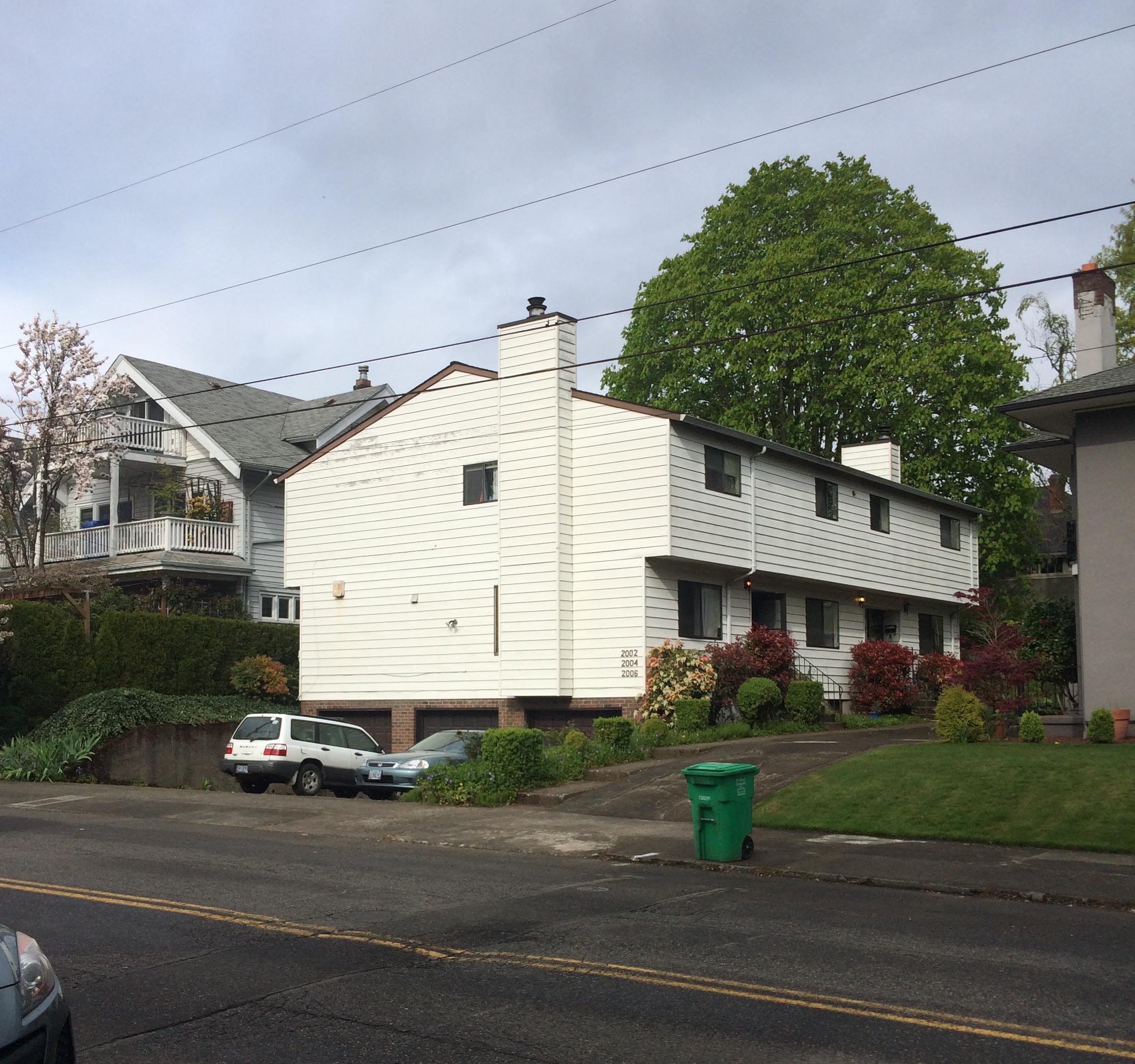
The building industry's current standard response to the duplex zones justifies a similar intervention. Compare the way the following buildings relate to their context. The one on the right is called "Z House" because of its clever offset floor levels, and for its residents, it's probably a pretty nice space to occupy. However, it has a minimal relationship to the public realm and the neighborhood. One-offs like this are not really a big issue, but cumulatively, the impact is huge. Part of what makes cities wonderful is the way they add up to more than the sum of their parts. This is because the individual buildings relate synergistically and support life between buildings. When life takes place entirely inside buildings or designated outdoor recreation spaces, you get suburbia. 
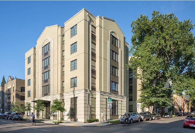
z house.jpg

We want to conclude this essay by noting that we're not advocating an absolutist position on parking by any means. The correct lesson to take away from this exploration of building forms is that in the Prewar era, building form took precedence and parking was an afterthought -  shoehorned into the residual space on a lot. In the Postwar era, however, parking began to drive the design process. Garages were situated on sites and residential space was shoehorned in around them. As we can see from the illustration below, older development has room for off street parking. The difference is that unlike the last image, where the housing is stacked on top of the garage, cars are accommodated on-site; they just aren't invited into the house itself. They are allowed on site, but the principle structure is a building for people

Afterthought.jpg