Asking for better design isn't elitist, and doesn't have to be more expensive either.

29315018_10213506039497956_2792702514565218304_n.jpg

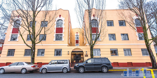
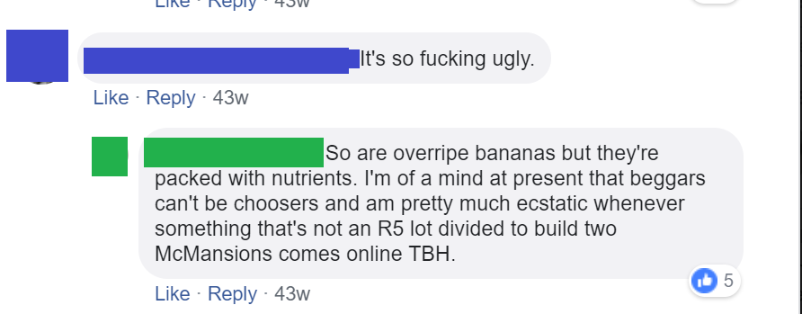
Recently, I have seen conversations in our community pitting the ideas of affordability, availability and design against one another in terms of new construction in Portland. A recent example, was an exchange over social media I witnessed between two friends of mine on the topic of a newly built apartment building here in Portland.

conversation in reference to building above.

conversation in reference to building above.

We find ourselves at an interesting crossroads in Portland; we are experiencing record population growth and will continue to do so for decades to come.  As a constantly growing region, it is important that we ensure that our fellow community members actually have enough physical places to live. Statewide land use law in fact requires all cities and regions plan for a 20 year land supply for housing, commercial and industrial. Housing availability, not just affordability, is one of my personal pet issues for our region. The way we currently have our city laid out zoning-wise in terms of its overall population capacity, we are simply not footing the bill for our own future growth. As someone who plans on being around to witness the next few decades of Portland’s story, I am afraid we are not rising to the challenges that are facing our community. We absolutely need more high-density infill in Portland to ensure there is enough housing available for the future citizens of Portland.


Are you ready for 50+ more years of Portland life with the Linden?!?!?!? 😢NE12th/Burnside/Sandy

Are you ready for 50+ more years of Portland life with the Linden?!?!?!? 😢

NE12th/Burnside/Sandy

While I am concerned about us meeting the demands of our own population growth over the next couple of decades, I am also concerned about what the qualitative experience of living in Portland will be like decades from now. We do have a strong likelihood of having to accommodate millions more people in our region in the coming decades, due to factors like climate change. When we build new things in our city, especially larger pieces of construction like apartment buildings, we need to understand that these are things that can stay with us for 50 to 100 years.

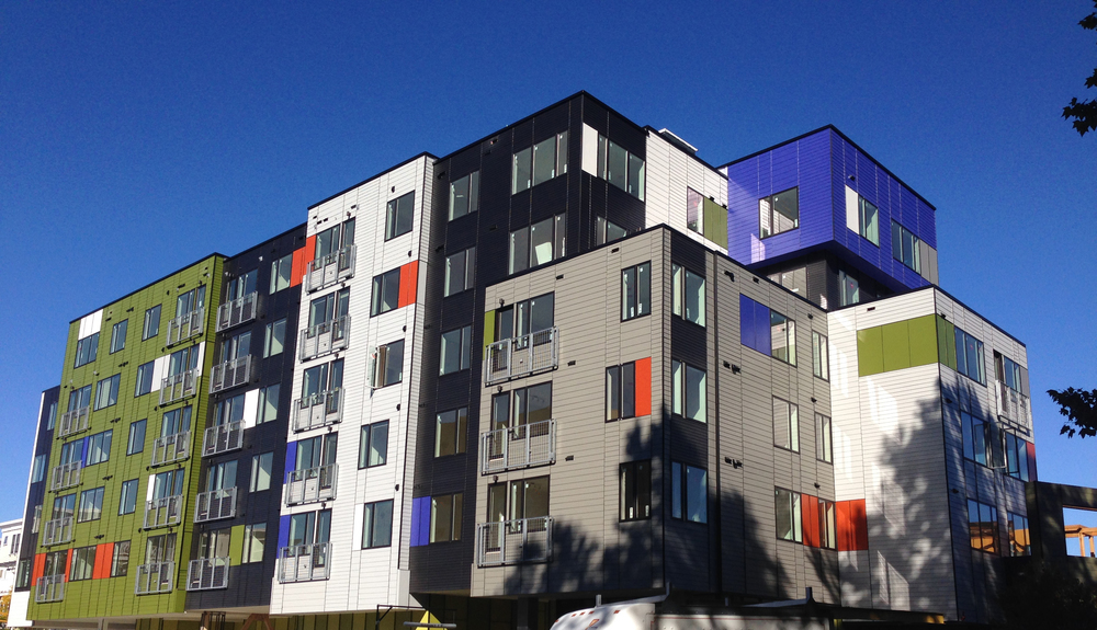
Truly inspiring, I can’t wait to age in place here… Seattle time! 🤢

Truly inspiring, I can’t wait to age in place here… Seattle time! 🤢

Seattleite Millennials/GenZ will be clamoring to preserve this wonderful piece of human history in 2060 - or not…

Seattleite Millennials/GenZ will be clamoring to preserve this wonderful piece of human history in 2060 - or not…

We shape our buildings and afterwards our buildings shape us.
— Winston Churchill, 1943


Buildings don’t just stand alone, they get to be a part of our everyday lives, the things we see and pass by on our commutes, where we hang out after work, or plain simply where we live. What we build now becomes the pixels in the background picture of our everyday lives. It may seem that we have entered a reality in our region where these two needs are now at odds; the need for more housing, and the need for aesthetically pleasing architecture for our community to be surrounded by as well as well-thought out spaces for people to occupy and build their lives around for decades to come.

Whenever I see this argument pitting design against housing, I can’t help but think:

Why can’t we have both?

Why can’t we have both?

Expanding housing supply is a “good.” Preserving historic architecture is a “good.” Planning places that encourage beauty, walkability, sustainability and sociability is a “good.” We believe it is shortsighted and foolish to pit goods against one another.

Look at this brand new beauty in McMinville (Hotel)

Look at this brand new beauty in McMinville (Hotel)

At P-D-X we have been chewing over the question of what “good design” is, and over the implications that come to mind for most people when they hear others talk about “good design” in architecture. We often hear that asking for better design is “Elitist” or adds “unnecessary costs” to projects that provide a functional use for our community - something we see in public housing all the time. I would personally like to challenge this thought process, and it is something that we do on a regular basis here at P-D-X Blog. It’s time to knock a huge hole in the false dichotomy of affordable vs well designed. Good design does not have to be expensive, it does not have to mean adding on additional costs to new housing, and frankly the conversation does not need to have an air of elitism tinged to it at all.

Part of the Goat Blocks off SE Belmont

Part of the Goat Blocks off SE Belmont

This is a nice little pixel on SE Belmont, is asking for design like this elitist?

This is a nice little pixel on SE Belmont, is asking for design like this elitist?

These are both new 3 story buildings, by looking at the amount of materials used, Can you guess which build cost more per sqft? Which one is better designed?

These are both new 3 story buildings, by looking at the amount of materials used, Can you guess which build cost more per sqft? Which one is better designed?

Most of the time, the best designed buildings aren’t the ones that you see on the cover of an architecture magazine or text book. They aren’t the buildings that architects and enthusiasts want to rave about around the world. They are the buildings that understand their role as a pixel in the background image of our lives, ones that simply choose to blend into the background, becoming a normal part of the city’s fabric, those are the buildings that represent good design. Those building examples, are often not the most expensive pieces of construction either.

In the past Jonathan has identified and broken down some of the elements that we regularly see in new construction around Portland that contribute to those new buildings often being seen as “ugly”. Simple design is often good design, focusing on tried and true elements is often good design.

Urban Design, as a discipline, takes a more holistic view of cities and districts and focuses on how the parts of a community add up to a greater whole.

When we talk about design, we’re also talking about things like curb cuts, curb radii, street trees, stoops, front porches, front doors, driveways, “eyes on the street,” etc. Some of these things are site design and arrangement elements, others take place in the public realm, i.e., the right-of-way, which we own collectively.

Bad Design

Bad Design

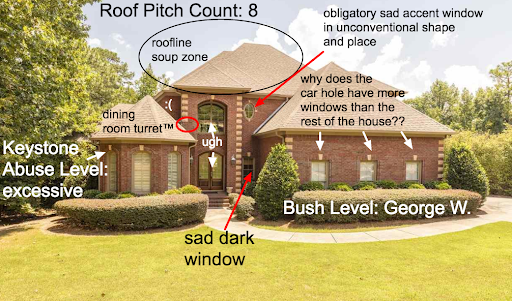
Some of the worst design we see in modern construction doesn’t come from low-budget efforts, but from higher-cost luxury designs. If anything, the wealthy happily prove time and time again that they are more than willing to lay down huge amounts cash for the most tasteless poorly designed housing imaginable, in fact, there is a whole other blog dedicated to just this point.

unnamed (3).png
Images courtesy of Mcmansionhell.com

Images courtesy of Mcmansionhell.com

Portland does deserve high design but let’s be honest, if you don’t really have the chops in design skill and are more than willing to lay down the extra capital on higher quality materials and design, then don’t even bother. High design is great left for institutional developments and other organizations with higher capital and the grit to throw down in a type III design review.

If your goal at the end of the day as a developer or architect is to throw up a regular commercial/residential building in the city and collect a paycheck, then stop trying to cheaply pursue high design that looks terrible and just go with a tried and true simple, classic, and already affordable design pattern. Most of the time we need our new buildings to be a pixel in the image, a part of the scene, not the stand out kid in the class. We need architects to stop looking at every new piece of construction as a standalone piece of art formed by their own mighty hands, but as a player in the greater symphony of its location.

Somebody put Chad Kroeger from Nickelback in this symphony.

Somebody put Chad Kroeger from Nickelback in this symphony.

nice

nice

In part because of our trailblazing architectural history, we can often find our best urban future in our urban past - no need to reinvent the wheel everytime we build something new.
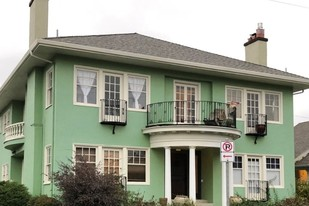
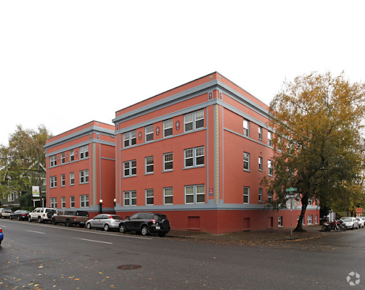
 Check out these neotraditional new construction examples by R John Anderson from the Small Developers Facebook group.

unnamed.png
Believe it or not, the absence of extra materials for weird flanges, hats, and other pieces makes these buildings cost less to build.

Believe it or not, the absence of extra materials for weird flanges, hats, and other pieces makes these buildings cost less to build.

We need more housing, we will need a lot more housing to keep up with future demand. But we have to remember that we aren’t just building housing, we are building places for people to live and build their lives. Places where people tell their own stories. Are we building the best setting for the story of future Portlanders? When we are building Portland, we need to be considering the perspective of future Portlanders.

  1. Will we enjoy living there?

  2. Will we still want to live in it or use it 50 years from now?

  3. Will we be proud of it?

Everything in housing is a trade off, but we don’t have to trade off good design for affordability and availability. We have to change the way we interact with design at the regulatory level. The market will follow the path of least resistance around the codes and regulations we put in place, so we need to understand how the design rules we make play out on the drawing board when market actors are balancing regulation, design, and financial considerations.


We can streamline our design standards so doing the simple, time-tested approach to design is the path of least resistance. There is a common myth that better design requires more man-hours put into design. This implies that buildings basically design themselves and the default outcome is an ill-formed ugly building. Throw more hours at it, so the myth goes, and the design gets better, but the architect’s bill gets bigger. First, architecture is not a big enough share of total project cost to have a huge impact. Systems Development Charges (SDCs) for example, have a much greater impact on a developer’s pro forma. Moreover, much of our worst “developer modernism” reflects a pointless quest for novelty that is inherently wasteful. Slashing the architect’s fee to a bare minimum won’t have any discernible impact on rents either. For one thing, owners set rents to what the market will bear, and any savings in cost to to the investors. The overall design fee is trivial compared to land, construction, fees and labor costs.

Aura Burnside

Aura Burnside

Modularization and creating form based design codes so that it is less resource intensive for builders and designers to create reliable and abundant housing consistent with the design standards of the community is the key.

“Where design gets expensive is when bad design gets caught by design review and sent back to the drawing board for a do-over. It’s really the time and redundancy of multiple attempts where costs pile up. The bland and forgettable Aura Burnside was rejected multiple times before approval. It’s only as good as it is because the previous attempts were so bad. Developers wanting a quick one-and-done design review process could opt for a more traditional composition mode for a guaranteed outcome. This leaves discretionary review to those who a) have the chops for it, and b) count on high design having a real pay-off in terms of project value and feel like it’s a worthwhile investment. Communities have already done much of the hard work to figure out and codify a baseline standard for design of good fabric buildings.”

-Jonathan Konkol on Aura Burnside

In the past, we have proposed a transect type system, tools such as pattern books: simple, pre-approved designs that get to skip review because that have already been vetted are things that should be offered by neighborhoods to alleviate much of the friction in design review.


This isn’t  a zero sum game; we can have both things, and we have every right to demand them. We can build the housing capacity we need while also ensuring that the environments we build will be enjoyed for generations to come. Someday Oregon’s population will be double what it is today, what is the best possible version of life in an Oregon with that many people? How do we start laying the groundwork for it today? We start by involving communities in planning for their future. Once we establish that we are going to grow, we must work for a grass-roots, community-supported vision of how we’ll grow. Already, pioneering groups are leading the way in this process here in Portland. We should expand and build on work like this.

All design is expensive.  Good, bad, no new building is cheap, and no brand new apartment is going to rent for below market rate, unless it’s being subsidized.

Even adjusting for inflation, all the inputs to building, land, materials and labor, are more expensive than they’ve ever been. Loans aren’t cheap either. Therefore, no building is going to be cheap. Good design, bad design, it’s all expensive. Rolling over the good design argument in favor of availability and affordability does not compute when it is taken into consideration with the daunting other costs associated with new construction.

Let’s take just one minute to get together and talk about design as a community, talk about what we want to do and see in our home for the following decades of our lives. Let’s wrap that up into a nice package so that builders have an easy path and know exactly what they need to do when it comes to building Portland. No more need to have every new piece of construction caught up in months of debate over design with the community, the community should set their expectations ahead of time.

We as a community need to get together as a group and have an honest conversation about what our growth over the following decades is going to look like. We will need to add more housing in all neighborhoods, let’s plan that out ahead of time so nobody is taken by surprise. Let’s talk about what our visions are for the future of Portland, and set our design standards for the community. We here at PDXplore are working on partnering with other like minded groups to do just that. Please reach out if you would like to join that effort.

Wut?

Wut?

Transporter Accidents

beammeup.jpg

Science fiction is replete with metaphor, so to continue our theme from the previous post, we’d like to explore some particularly unfortunate design trends using Gene Roddenberry’s idiom. Readers may recall Star Trek episodes where transporter technology was central to the storyline. If Scotty, or Miles O’Brien screwed up the transporter, horrible things might happen, like somebody getting beamed into a wall or something.

Accident.jpg

Something similar seems to be happening to buildings in American cities.

603+Concord+Ave.jpg

Where the quest for novelty and expression of a zeitgeist meets investor driven budget concerns and standardized off-the-shelf parts, we get the current architectural meme, “break up the box.” The idea comes from a dictum, frequently expressed in city design guidelines, that architects break up large masses into smaller scale modules. On the face of it, this sounds like a good idea. And it might be if it were done with any logic or rigor. The idea is that large buildings are inherently ugly and alienating. A categorical assumption like that should make you suspicious. We can all call to mind large buildings we’ve seen that are elegant, pleasing and allow us to get a sense of human scale by the way they are composed. Some large buildings are dreary and oppressive, and these codes can probably be seen as a reaction against failed utopian megastructures like the public housing projects of the mid 20th century.

developer-modernism.jpg

At the same time, in a post-postmodern world, we don’t really have a coherent style we can identify with our time. Other eras had dominant styles, and most people were pretty familiar with them. It was pretty easy for the lay person to tell which designs embodied the style well and which were interpreting it poorly, or in a superficial way. Today it’s very hard to judge competent application of a style, since we can’t even agree on what styles are appropriate. The culture of the architecture and design world has become divorced from the culture of building and trades, exacerbating the problem. Before this schism, builders with little formal education participated in a culture of building that yielded uniformly coherent, pleasing forms regardless of the budget of the project.

Today’s typical speculative buildings, by contrast, offer no sense of craftsmanship, and often flat-out reject well established principles of symmetry, proportion, hierarchy or really any kind of visual logic at all. Instead, we’re presented with pointlessly arbitrary shapes and materials, arranged in a skin-deep composition that starts to look more and more forced, the more we’re forced to look at it.

Author Charles Siegel puts it pretty clearly:

“Unfortunately, almost all contemporary architecture schools ignore traditional design, so architects who try to imitate the human scale of traditional architecture sometimes do not know its basic principles and come up with very strange designs. Their most common error is trying too hard to break up the box: they overdo it and produce cluttered designs, because they do not know that traditional architecture uses a nested hierarchy of scales, with a ratio of about three-to-one between each element and its sub-elements.”

Here’s how it works. A goofy array of shapes, suggesting a bunch of different smaller volumes are overlapping in space.

Transporter Accident 2.jpg

This is what we’re supposed to understand about those shapes; that we’re actually looking at several distinct volumes that have materialized in the same space, with little bits spilling out around the edges.

Transporter Accident 3.jpg

Viewed from above, we clearly see this for what it is. A silly outfit on the surface of a box.

Transporter Accident 6.jpg

Take off the garments, and the true nature of the form is apparent.

Transporter Accident 4.jpg

Let’s watch the design process for this obnoxious gimmick in action:

Transporterfail.gif

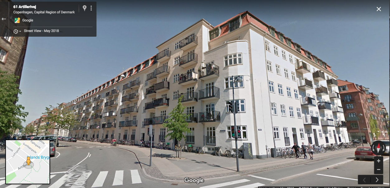
What’s the answer to this mess? We have two recommendations. First, build smaller. Human scaled buildings, like the ones we built throughout human history, don’t need to be broken up. Take a walk along NW 21st for example and this will be very evident. Second, if you must build big, just own it and be big. Appropriately scaled details, per Siegel’s ratios can make a beautiful, coherent composition that doesn’t rely on cheap gimmicks. Our counterparts across the Atlantic have been doing this quite well for a very long time. We’ll conclude with a selection of European examples, in a variety of styles. We’ve rounded up four Danish examples, followed by three from Rome. All of them are large, but none look like a smattering of smaller elements arbitrarily jammed together. You be the judge…

CPH 1.jpg
CPH 2.jpg
CPH 3.jpg
CPH 4.jpg
Rome 1.jpg
Rome 3.jpg
Rome 2.jpg

Suburbs: Deep Space Space 97006

Terrok Nor Town Center

Terrok Nor Town Center

The authors of this blog have been spending a lot of time roaming the suburbs for work lately. As we drive our vehicles around the postwar landscapes of Gresham, Happy Valley and Washington County, we’re stuck by how much the experience is like being outside the atmosphere itself.

Plenty of room at the outer docking ring.

Plenty of room at the outer docking ring.

Suburbia consists of a formless void with no oxygen or habitat suitable for humans between buildings and designated activity zones. There is no “Life between buildings” (Jan Gehl). The shopping center is a space station. Your house or apartment is another space station. So is the school, and your workplace. You can’t go outside without a space suit. You get in the shuttlecraft and pilot from destination to destination at warp speed, so you hope, but instead you’re stuck creeping along at one quarter impulse. The cops are Cardassians. The teenagers are Klingons (who cares if we die? We’re going to Stovokor!).

Federation Shuttlecraft

Federation Shuttlecraft


Surface of the Moon

Surface of the Moon

There’s lots of space here, but it’s not for humans. It’s all interstitial. At best, one can walk safely across a parking lot, but it’s not a place to linger.

Take a starship and fly to a planet. Beam down in Downtown Portland, Hawthorne or some place on the coast or the mountain for shore leave. Walk around. Go back to your station. Entertain yourself in the holodeck (a simulacrum within a simulacrum).  


One of last year’s most iconic images sums up the experience beautifully!

Top down on a sunny day!

Top down on a sunny day!


Diagrammatic Compatibility

west elevations tinted linework.jpg

There’s a perennial debate in the  design and planning world about what kinds of standards are appropriate for new development in a historic context. Should new buildings blend in, or stand in contrast? Is it “phony” or “context-sensitive”to replicate historic vernacular forms?

This post is the result of a conversation with city staff regarding Portland’s Conservation Districts. Over the course of the conversation, while trying to articulate what I thought was most important about compatibility and integration of new buildings with existing fabric, I hit upon the phrase “Diagramatic Compatibility.” This idea really connected because it stands in contrast with other conventional notions of compatibility, and gets at a deeper level of design than the (literal) superficial matching of materials, colors, etc. that some codes prescribe.


Diagramatic compatibility can be defined as matching the key schematic elements of composition for a block or district. It includes approximate massing, proportions, overall height and setback lines, relationship of the building to the street, to its site, and the rhythm of buildings along the street in relation to one another. This is distinct from the particular vernacular style of the building (Queen Anne, Tudor, Craftsman, Prairie Style, Streamline Moderne, etc.).The latter refers to the particular visual language of a building, while the former refers more to what it’s saying in a given language.


Often a new building is neither stylistically nor diagramatically compatible, in which case it’s easy to be confused about why it feels like a bad fit. My argument is that diagramatic compatibility is far more important than stylistic compatibility.

New construction in the Boise Neighborhood

New construction in the Boise Neighborhood


It is my contention that a house or building that is stylistically dissimilar yet diagrammatically compatible is far more appropriate and responsive to its urban context than one that is nominally of the same style while exhibiting a very different configuration, massing, relationship to site, etc.

23rd & Columbia1.jpg
Queen Anne Victorians and a contemporary addition, 23rd Ave. Seattle

Queen Anne Victorians and a contemporary addition, 23rd Ave. Seattle

This row of Queen Anne Victorians in Seattle’s Central District was joined by a new neighbor fairly recently. As you can see, the newcomer is composed in a completely different idiom, yet it continues the rhythm of the row of houses that came before it.

Simplified elevations

Simplified elevations

victorian elevation annotated.jpg
contemporary elevation annotated.jpg


victorian axon annotated.jpg
contemporary axon annotated.jpg

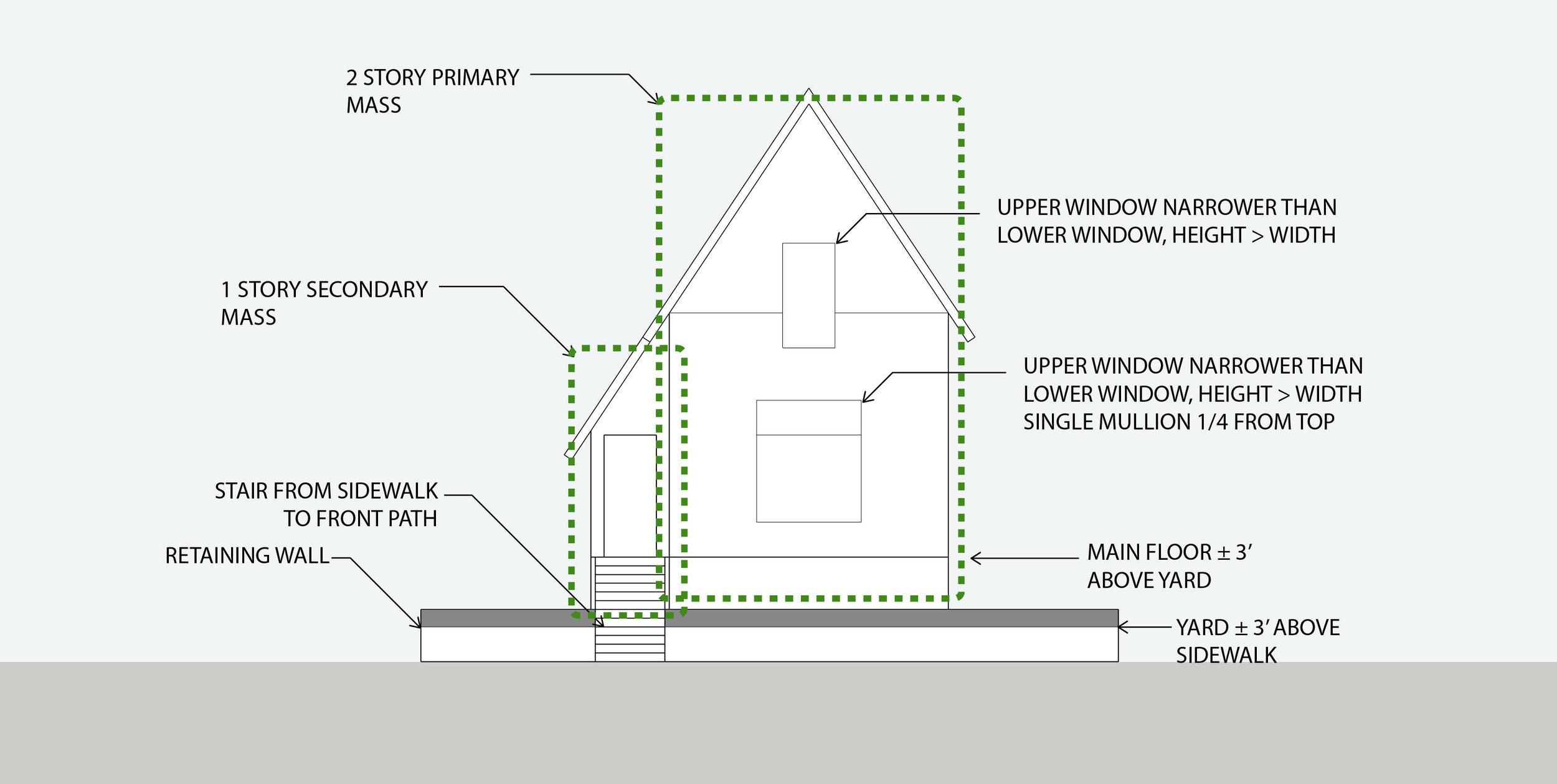
What matters here is the overall proportion of the building, its pattern and placement of windows and doors, it’s overall form factor, and its relationship to the site and to the street.

What “historical” typology is this?

What “historical” typology is this?

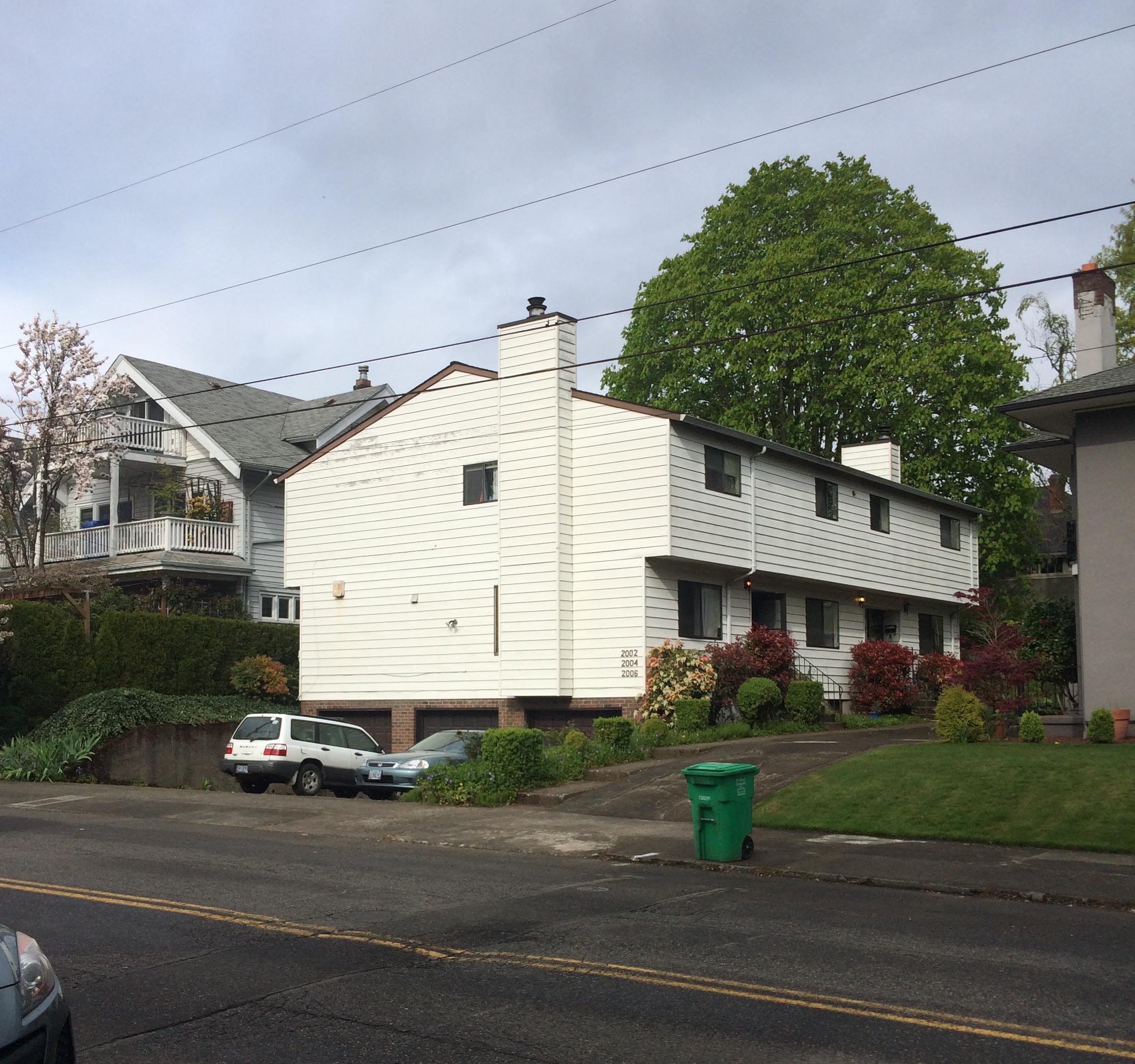
By comparison, this new addition to the Boise neighborhood at NE Fremont & Rodney is at least nominally compatible, in as much as it is composed in a “historical” vernacular. However, something about it just doesn’t look right. That’s because its particular configuration, large house with the main floor elevated above the ground plane on top of a two car garage, with a wide driveway taking the place of a lawn and stoop, is something that doesn’t have any historical precedent. It’s an entirely new configuration, dating to within my lifetime. There are a few early 20th century houses that have basement garages, but they remain subordinated to traditional site arrangement principles.

Finally, I’d argue that vernacular ways of building, which are sometimes referred to as “historical” are not anachronisms at all. They are still perfectly valid ways of building. Existing examples constructed in pre-war vernacular are highly functional and beloved by their residents.

James Duthie House, 1728 SE Belmont

James Duthie House, 1728 SE Belmont

I personally resided in one of Portland’s oldest houses, the James Duthie house. The house has been partitioned into a triplex with upper, ground floor and basement units. I lived in the upper unit. I found it both convenient and enjoyable (not to mention spiritually uplifting to experience continuity with generations of residents reaching back to the Lincoln administration).

Carlton Landing, Oklahoma

Carlton Landing, Oklahoma

This recent courtyard townhouse project Carlton Landing in Oklahoma was brought to our attention by our esteemed friend and incremental development advocate/coach R John Anderson. It demonstrates that contemporary buildings with a vernacular design vocabulary aren’t necessarily “fake history” - they’re just good, carefully detailed, thoughtfully designed buildings. There’s absolutely nothing obsolete about the overall composition or architectural expression here. Most importantly, the diagrammatic form of the building is entirely consistent with the Prewar, non-autocentric forms we advocate here at Plan Design Xplore.

Write for Plan Design Xplore

Submission Photo.png

Like our content and our mission? Come join the team and write for us! It is our goal to broadcast more voices to the world of urban design and planning in Portland and the greater Pacific Northwest. Share your thoughts on our Building Portland blog or join us for neighborhood tours and help us generate our Case Studies for our Lexicon, we would love to have you on board.

We also have a number of new programs coming up that we can plug you into, from our Imagination Challenges which will be launched by the end of the year, to our future neighborhood podcast coming in the Spring. If you want to hone your interviewing skills, let’s get in touch with some of your favorite architects and developers around Portland and provide our community with the story behind the places they build and design.

The opportunities you have with P-D-X as a writer and contributor are great, we will provide you with the platform, the social media presence, and the editing power to get your thoughts and designs out into Portland’s housing conversation.

Submit your writing, or contact us for more details at Write for P-D-X

Solutions in search of a problem

autonomousvehicles.jpg

This post is a response to a presentation on Autonomous Vehicles to the Issue Forum on the Environment at the City Club of Portland.

If autonomous vehicles are the future, and there's no stopping it, it’s going to be a profoundly depressing one if you’re somebody who loves traditional urbanism. Cities in other countries have already solved the problem of urban mobility, and they have largely done so with 19th century technology. A combination of cycling and rail infrastructure serves Copenhagen very well, and it has the lowest share of all trips made by car of any city in the world except maybe Amsterdam. This is all provided with publicly owned infrastructure: bike lanes and walkable streets, and a three tiered state-owned rail system. Metro subways, suburban commuter rail, and intracity rail. 

Buses and covered bike parking at Nørreport Station, Copenhagen

Buses and covered bike parking at Nørreport Station, Copenhagen


As with many high tech solutions, I think the AV phenomenon is a case of technological fetishism combined with corporate capitalism's existential need to sell us more things. The so-called Smart City infrastructure needed to get an AV system up and running would be very expensive, and presumably funded in large part by municipalities, for the ultimate goal of selling more cars. A relatively low-tech, very effective method of solving urban mobility issues is a non-starter here because capitalists are the clients of government, which prioritizes their need for profit when addressing any social issue (see the farm bill, private prisons, our health care system, etc.). This is not to say that mercantile capitalism shouldn't exist in any form to deny that it produces innovations. Indeed, lots of great shiny widgets have been developed in recent decades because consumers like them and see value. That's all well and good, but things like smart phones are a technology one can opt in to or out of. When it comes to things that quite literally shape our cities, we must recognize that it is not in societies best interest to let capitalism and corporations drive the bus, as it were. 


In short, just because we can, doesn't mean we should. Our mobility problems are not a result of insufficient technology, but rather poor resource allocation. Doubling down on a technology (cars) that has already proven extremely destructive from a land use, sustainability, resource efficiency and public health perspective does not strike me as great policy. 

And don’t just take my word for it. Walkable City author Jeff Speck has a similar take on it.


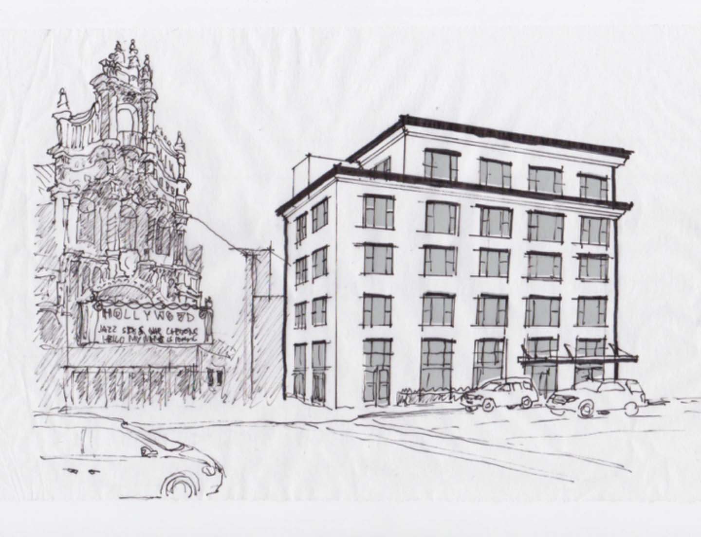
I fixed ur building lol

This building is badly deformed. It has pointless flanges and ribbons, to make it more “interesting.” The flange on the right makes a “C”. C is for “clusterfuck.”

Hollywood1.jpg

Let’s see if we can’t rationalize this a bit.

Hollywood2.jpg

Using a simple, time-honored scheme of proportions, traditional widow forms and strong cornice line, this blobby mess of arbitrary forms now looks clean and elegant. It doesn’t compete with the glam-rococo forms of the theater!

Hollywood3.jpg

Note that it’s not ornamentation we're going after here. The lavish blingy forms of the theater are true to their historical precedents and have a rigor that makes them rational, whether you love them or hate them. They follow rules of order, symmetry, hierarchy and proportion. Now the apartment building also follows some well-established rules rather than screaming for attention with arbitrary, tacked-on shapes that have nothing to do with the structure of what’s going on inside it. So much better!

Tallboys, The Floor is Lava, and Other Consequences of Parking

This is the beginning of what will be an occasional series on the design impacts of parking on urban housing. Let's start with a look at what we'll call the "tallboy" - referencing those 16 ounce cans of cheap beer or malt liquor, for when 12oz just isn't enough. Here's one, under construction in NE Portland. 

 16oz of residential pleasure


16oz of residential pleasure

Distorted proportions represent distorted priorities

Distorted proportions represent distorted priorities

The stretched proportions of the tallboy houses are a parody of the archetype of the house. We generally share an ideal image of a house, and it's reflected in the homes we've built for ages. The image of "house" is has a loose canon of proportions, neither too high, nor too wide, and we can observe this in a walk around our neighborhoods. As a rule, the height is generally less than twice the width, or the width is never more than twice the height. 

Oblong

Oblong

The archetype, with its infinite variations, is the monopoly house. 

The universal signifier for "house"

The universal signifier for "house"

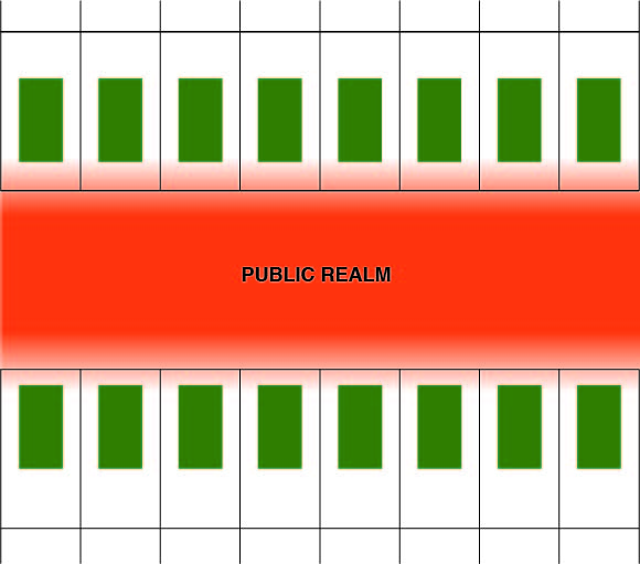
Beyond the cognitive distress of these funhouse mirror distortions of basic form, there are some real urban design impacts to consider. These impacts are eminently quantifiable too. Let's examine the traditional relationship of dwelling to public realm. Streets are more than just a network of routes from place to place; they are public spaces. Streets are the negative space between private spaces, where civic life, life between buildings happens. The sidewalk is where public meets private. In traditional neighborhood design, there is a sophisticated gradient mediating between public and private space. This gradient is defined by both horizontal and vertical separation. The distances involved do not need to be huge to be effective either, as we will see below. 

public-private.jpg

The 21st century spec townhouse eliminates this gradient however, isolating the dwelling behind what is basically a small parking lot. The pedestrian experience is degraded to a stroll past the ass end of a row of luxury SUVs in more than a few projects we've observed. 

Parkinghouse.jpg
Normal 2D.jpg

The traditional neighborhood design, with its graduated layers of privacy is based on the way the building relates to its site. The ground plane, shown here, is the plane that the building sits on. The way the building relates to this plane (or doesn't) has an enormous impact on the way it functions, and what it contributes to the public realm. Some buildings are fortified and hostile, while others are open and permeable. Urban design studies have confirmed people seek out places characterized by the latter and avoid the former. 

Tall 2D.jpg

When the building is raised up above a garage, the traditional ground plane zone is levitated, functionally eliminating any relationship between interior space and the yard and the street. This turns a house into a one story apartment building. Indoor outdoor living and the opportunity for gardening is usually replaced by a useless space covered in "beauty bark." 

This levitating condition results in a design motif we've come to think of as "the floor is lava." What we see here is a row of houses, that, if they were situated on a traditional ground plane, would actually be pretty great. 

Tallboys Ground Plane.jpg

But no, we can't touch the ground. It's lava!

Floorislava.jpg

Designs like this have brought a lot of undeserved heat on the "skinny house" typology. We don't think the skinny house is a priori a bad form. It often is, though, and that's a direct consequence of trying to shoehorn parking into the typology. As we can see here, skinny houses situated on the ground as God intended, are quite attractive. We suspect many people who pass these on the street never even guess they're 21st century interlopers. 

short bois.jpg
Lair Hill Stoops.jpg

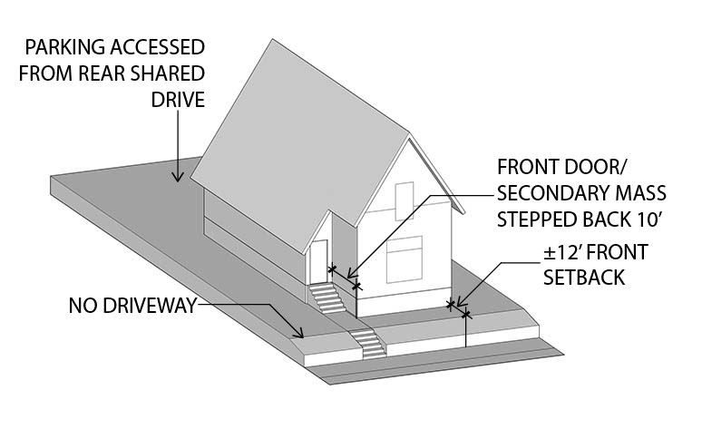
They contribute synergistically to the neighborhood because of the way they relate to the ground plane and to the public realm. The public/private gradient and the stoop can function in a very dense, urban setting, and doesn't necessitate huge setbacks. Here's a row of early 20th century homes in Lair Hill. The front walls are no more than 10' from the lot line, and the porches are possibly as close as 3'. However, it's very clear what's public and what's private, and the pedestrian environment is a safe, inviting place. 

IMG_3912.jpg

Contrast that with this recently completed project on the east edge of the Eliot neighborhood. When you prioritize parking, which is what most unsophisticated spec builders, and the lenders who fund them do, you get parkinghouses. These townhouses are in the R2 zone, and represent a pretty typical market response to that zoning. 

Lets be very clear here: absent any additional code stipulations on building form, upzoning single family areas will not result in more of the Prewar plexes and small apartments we and others have profiled and analyzed. What we will most likely see is more of what we're already getting in the R2.5 and R1 zones; very large, luxury townhouses stacked above parking. No stoops, no transition from public to private, just places for cars, and houses jacked up in towers, like a one or two unit apartment building. 

Gentrifyhaus.JPG
Parkinginfront.jpg

Portland has ample precedent for code interventions that block the worst of auto oriented design. Our planning community recognized decades ago that when parking dominates the design process, we get quantifiably bad outcomes. Strip malls and similar retail designs that set shops back from the street behind seas of parking have been outlawed in most of the city's inner commercial zones. As of 2018, new drive through uses have been outlawed city wide, extending a ban on new drive-throughs in the Central City Plan District to the whole of Portland.

Similarly, "snout houses" were banned by the city's residential code. It's really not hard to see why:

Snout Fever.jpg

The building industry's current standard response to the duplex zones justifies a similar intervention. Compare the way the following buildings relate to their context. The one on the right is called "Z House" because of its clever offset floor levels, and for its residents, it's probably a pretty nice space to occupy. However, it has a minimal relationship to the public realm and the neighborhood. One-offs like this are not really a big issue, but cumulatively, the impact is huge. Part of what makes cities wonderful is the way they add up to more than the sum of their parts. This is because the individual buildings relate synergistically and support life between buildings. When life takes place entirely inside buildings or designated outdoor recreation spaces, you get suburbia. 

z house.jpg

We want to conclude this essay by noting that we're not advocating an absolutist position on parking by any means. The correct lesson to take away from this exploration of building forms is that in the Prewar era, building form took precedence and parking was an afterthought -  shoehorned into the residual space on a lot. In the Postwar era, however, parking began to drive the design process. Garages were situated on sites and residential space was shoehorned in around them. As we can see from the illustration below, older development has room for off street parking. The difference is that unlike the last image, where the housing is stacked on top of the garage, cars are accommodated on-site; they just aren't invited into the house itself. They are allowed on site, but the principle structure is a building for people

Afterthought.jpg

Lloyd Russell - Part II

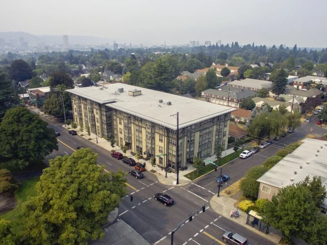
Creston Lofts Building 1 (east)

Creston Lofts Building 1 (east)

The following is the second half our Plan Design Xplore's interview, which we began last week, with Architect/Developer Lloyd Russel of San Diego. Our conversation started with a discussion of Russell's Creston Lofts project in Southeast Portland, and lead to a wide ranging discussion of development, zoning and urbanism in Portland. 

Plan Design Xplore: What were some of the regulatory challenges and hurdles that you faced?

Lloyd Russell: We didn't have any - I didn't perceive any - I mean the zoning was great and We didn't have problems with that. Our biggest problem was we designed it and Andy had a kid!

And then we decided that can we hold this property for a couple years. We're gonna do something and we got back onto it. The only challenging thing was we had designed it at one point, and then we took it back up again a couple years later just finished - you really raised the money and push it through and stuff like that and the bigger challenge was the financing, I think, because even though Portland didn't require any parking there were a handful of banks that looked at us and said you don't have any parking? We're not gonna give you a construction loan we think you're crazy.

I think the form based zoning, I mean I love it, but it could be abused, and that’s why the Creston is kind of a critique of that. It’s embracing the form based zoning, but I’m trying to set a model for what I think it should be.

There was also a project on Hawthorne, I think, that exploited that no-parking policy by doing 80 units with no parking, and the Business Improvement District or something had them in a lawsuit or something.

PDX: I think that's probably the one kind near the new Safeway at say about 28th, 27th-ish. That's a large one of the largest projects on Hawthorne.

Hawthorne Twenty Six

Hawthorne Twenty Six

LR: That’s one where they’re kind of abusing the zone, and I think the form based zoning, I mean I love it, but it could be abused, and that's why the Creston is kind of a critique of that. It's embracing the form based zoning, but I'm trying to set a model for what I think it should be, as opposed to you know 80 units with no parking and Just maxing everything out that doesn't feel right?
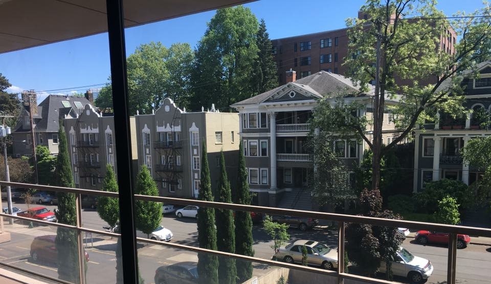
PDX: One of the things that we want to offer is our own critique of development and the development status quo in Portland, and see what are the “black hat” and “white hat” scenarios for development under our existing code and hopefully use form based principles to guide better outcomes.

LR: When we’re teaching, you know you're trying to empower the architect and we talk about… we tell them how to make a pro-forma, how to develop it. How to develop real estate, how it’s very profitable; it's more profitable than being an architect. You know we talked about how these kids can go over to the dark side, and so what we end up with, what we quickly get into discussion about is ethics. What’s the right thing to do?

We talk about it all the time, about housing, and your responsibility in the city and being a good urbanist and all this sort of stuff. I don't think that discussion should ever end. It's not just about maxing out zoning diagrams.

PDX: That's pretty much exactly why we got this project going in the first place is exactly that concern!

LR: Let me give you a little background. So in San Diego, they were building a ballpark downtown and they were updating the [planning ordinances] for downtown and one of the guys that was that worked at the Center City Development Corporation was this guy Gary Papers, who came from Portland.

So he gave me a little background on how the form based zoning was intended to work back in the day, and what the Planning Department wanted. They would go into an area and make a little node. You know on Hawthorne there are these nodes, like every five blocks or something where anything goes. You know, no FAR, no parking…

I want to set the bar pretty high so that the neighbors - whoever gets to build next to me - no one does a crappy job. They’re going to build something nice, or they’re going to rent for less than my project.

Height limit up here, something crazy, you know, something crazy like that, and the first project that we get built in that area, the idea was that the Planning Department would be really strict, but have a lot of coordination with the developer to make sure the project was built well, and to a high standard because it would raise the bar for all the other neighbors’ different projects that would come along and they’d build stuff, and as there were more projects, eventually they would form some sort of Business Improvement District. Then the people in the neighborhood would have power and control over what got built next. But the first project is the one that sets the bar.

Maybe things started to move too fast at this point because things are getting built everywhere, but I took that to heart when we did the Creston project and said we've got the zoning on a couple other blocks, and I want to set the bar pretty high so that the neighbors - whoever gets to build next to me - no one does a crappy job. They’re going to build something nice, or they’re going to rent for less than my project.

PDX: So it sounds like you have a lot of good things to say about the CN1 zone and the kind of work that you can do there. Basically, you were scouting for CN1 sites, and this is the one that appeared?

LR: A couple of commercial zones that would work but Andy lives over by Reed College, and he says hey, there's a dedicated bike path, and the they're gonna extend the train over there. We just thought it was kind of a nice and appropriate project. I mean we looked at a whole bunch of stuff as well, but you can only do one project at a time. We're not a big corporation.

PDX: Let's talk a little bit more about the financing of this project. We would love to understand how it the deal was structured, if you had a difficult time with banks, etc. Where were you able to find financing?

LR: It was mostly… there was just funny that there were a couple local banks that wouldn’t touch us because there was no parking, more than anything else.

But the deal is I have a very simple partnership or I try not to have preferred returns for investors because that kind of puts the investors and developers at odds, and I try to just say, hey, everyone's in it together. I try to also to leverage my architecture fee and sweat equity so that sometimes takes a bank… it has to kind of think about that for a little bit, and try to find a good group of people that want to hold onto a building as opposed to trying to have it be speculative, and sell a building or have some crazy structure to their returns. I want people that are in for that for the long haul, that's all.

PDX: Well with all that being said all the challenges that come with designing and constructing anything new, what were some of the things that might have made the project easier to execute in the first place?

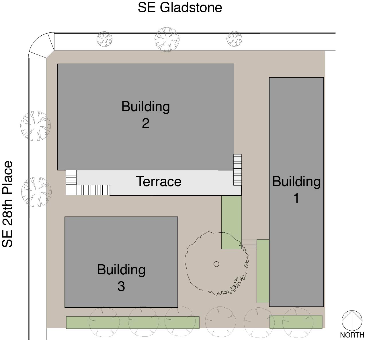
LR: After I did the three buildings I swore never to do three buildings again because it's an inordinate amount of exterior wall and then it got me nuts as an architect, as I'm trying to design so many elevations. That was more challenge than I thought, so the reality of it was really simple in plan; I've got three buildings clustered around a tree. It's the transition green into the neighborhood. But then it was like twelve elevations, and I hate doing elevations! I totally like figuring out 50 units in section and all sorts of other stuff.

Creston Lofts Site Plan.jpg

Next building, I don't care what it is. It's gonna be one. I'm not gonna do a campus of buildings again because that was a challenge. But it was kind of fun too, so I don't know…

PDX: What drove you into the direction of doing three separate buildings, a campus…

LR: It was a low infrastructure building, and just being able to occupy and activate the whole site, you know that was part of it, we've done a similar project in San Diego where it was an entire city block, designed by five different architects everyone did their own building. It was just it was really fun at that scale.

PDX: Do you have any plans of doing more projects in Portland in the future?

LR: Yeah, yeah, we're doing a little project in Brooklyn, on Milwaukie. It's across the street from Andy’s office; another eighteen unit project. It's different, it's a narrow and deep lot so the building is kind of like a long bar, But there's a little twist to it, you know.

PDX: Has it already been submitted for review is there something that we could go and look?

LR: It’s under construction. And you should talk to Andy. He’s my lead partner he's got his office across the street. We've known each other since the mid 90’s. We've talked about doing projects the whole time, so this will be our second one together. Our experience is so deep that we have an elevated level of conversation, and to me it's endearing because it's like he's a general contractor, and we can talk to urbanism.

The way it was developed was great at that area at the time. It was it was blighted and, one of the problems with blight and nobody can get financing ‘cuz there's no comps And this is a way for the city to provide to provide a bunch of housing types that other people could get comps to and get financing

PDX: That's terrific

LR: And actually, then I'll say that about that in Creston, That was the challenge was trying to get comps for the project because there wasn't much new product at that time and so it was hard for them to get comps for one bedroom units I’ve got a lot of one bedroom units and studios. Most of the rental stuff was two bedroom units and the more more efficient stuff in studios and one bedrooms and the housing stock was so old that the rents wouldn't support new construction. We were trying to tell the bank and the appraiser ‘till; we’re blue in the face that no, no we know this is gonna rent for X, and they're like yeah, we don’t believe you, but the appraisal came back, and it said so.

Now today, Portland's had such a boom that there's so many buildings and units it's easier to get in front of comps and get your financing in order. So we were kind of pioneers at that point with that project.

PDX: With that being said do you do you have any plans of doing more projects in Portland in the future?

LR: Yeah, we're doing a little project, in Brooklyn, on SE Milwaukie down there. It's across the street from [Andy’s] office; another eighteen unit project, but it's different, in that it's a narrow and deep lot, so the building is kind of like a long bar. But there's some little twist to it, you know.


A Conversation with Architect/Developer Lloyd Russell

LloydRussel.jpg

We recently profiled Lloyd Russel’s project Creston Lofts, located in the Creston-Kennilworth neighborhood in Southeast Portland. We were intrigued by this unique design, so we reached out to Lloyd for a conversation about Creston Lofts, Zoning, and creating community-oriented urbanism.

Plan Design Xplore: We came across Creston Lofts on one of our walks around Portland neighborhoods, and we think that it’s a really excellent project for a number of reasons and we wanted to ask you about how the project came about. Can you talk about the history?

I could never figure out why Los Angeles existed if my teachers at Cal Poly were telling me that architecture was the highest art and calling for anyone in life, and I could never answer that.

I couldn’t answer that question until I figured out that I had to ask the question of why buildings got built.


Lloyd Russell: So I'm an architect living in San Diego, from San Diego, I went to Cal Poly San Louis Obispo and spent my last year abroad in Copenhagen. When I was in college I was always questioning the role of the architect. How the architects could do more, because I was always driving back and forth from San Diego through LA to get to San Luis Obispo, and LA was like this bane on my distance, and I could never figure out why Los Angeles existed if my teachers at Cal Poly were telling me that architecture was the highest art and calling for anyone in life, and I could never answer that.

I couldn't answer that question until I figured out that I had to ask the question of why buildings got built and that got me into the economics of building. And then I also got into building buildings, not just being an architect; I liked to go out and work with contractors to build stuff. So long story short, when I graduated I found an architect that would do design-build, and built his own stuff, and develop his own stuff. And so I started working with him as an owner. I acted as an owner, a builder, and an architect-developer-contractor on a handful of projects so I got to see that sort of stuff so I get to have the role of an owner the role of a contractor the local architect, and then live in the building, to get the role of a user.


Before I had kids, when I had all this spare time, I also sat on some boards; in San Diego for the Community Redevelopment Authority. They were talking about the zoning policies and stuff like that and so I got to see it from a legislative standpoint as well. So I turned this little equation on all sorts of different angles…


PDX: We're really interested in understanding the architect/developer combo…

LR: [Teaching] has been consistent throughout my career, and we were always trying to teach housing. And we can never teach housing without a budget, because there's always constraints to housing, unless it’s a custom home and it’s pie in the sky, but it was always hard to convey to the students, like, some reality, and so we started to teach them a pro-forma, which is a little hard in an architecture-housing studio.

Eventually evolved into starting a program that we called a masters in real estate development. That was like ten or twelve years ago and it was how to be an architect developer, and it became a master's program for students at Woodbury University. I think it was one of the first ones in the nation to offer the whole thing. At first when we were doing this we thought, oh my God, we're just gonna create competition for ourselves in San Diego, and this is gonna be terrible! But it ends up that through the sharing of information we're not really competing against each other. It's more of a synergy, so there's a whole bunch of people doing like-minded buildings that are not the standard a developer building because they always have a little twist ‘cause there's an architect in there somehow and the sharing of information helps. But down here our big battle is this building department, and zoning that is just ridiculous.

I read the zoning document from Portland, and I was like Oh my god, you guys in San Diego are so myopic. You have this Byzantine zoning document that contradicts itself and nobody knows what it means and as a result nobody can build any housing and up in Portland you have this very concise, form-based zoning which is so clear to everyone that it makes it really easy to plan and develop projects.

When I was on the redevelopment board for the Center City, which was the Planning Department for downtown. That's when I started to work on Creston, and I read the zoning document from Portland, and I was like Oh my god, you guys in San Diego are so myopic. You have this Byzantine zoning document that contradicts itself and nobody knows what it means and as a result nobody can build any housing and up in Portland you have this very concise, form-based zoning which is so clear to everyone that it makes it really easy to plan and develop projects, and I was trying to get [San Diego] to incorporate some of the form based on it.


PDX: Your answer anticipates one of our next questions, which is why develop in Portland, since you're based in San Diego.

LR: My friend Andy [Lair] was a general contractor and we bought a piece of property together, but it was on a fault line and we had to sell it. He moved back up to Portland but we kept the conversation going and he bought a property up in Northwest [Portland]. It's kind of an industrial property, and he asked me to check out the zoning to see if he could do anything on it. When I read the zoning I was like oh my god, you don't want to do it there, but there's so many great areas in the city that you know came up, and you know I visited a handful of times and I just said you find a property that sounds like XYZ, and you know we'll do something. He had gotten his general contractor's license at that point, and then he found something and we started to work together on it

So that's probably what brought me up to Portland. I found it very similar to Copenhagen in the weather and in the urbanism; never really raining just, drizzly kind of thing. Everyone bought into the urbanism - here in San Diego, everyone's complaining about how, oh my god, there's no parking!

PDX: So to bring it back more specifically to Creston lofts. Help us understand its partí a little more…

LR: First zoning, where there was no limitation on the floor area or the density to set the form based zoning and it was near to where Andy lives so there's kind of a close connection to Reed College. If we have a 10,000 square foot parcel this will be a really interesting project and In that time Andy was showing me new projects around Portland because he was very concerned that we were going to do something very modernist and at that time. I think this was 2008, 2009, 2010 kind of time period. There was a big discussion about modernist versus historical stuff happening in Portland.

The design of Creston was actually kind of a critique of some of the projects that I saw at the time, where a lot of projects would just max out what they could do just because they could, and what I didn’t like was when you have the form base zoning and then it transitions into a neighborhood, and there was no transition!

The design of Creston was actually kind of a critique of some of the projects that I saw at the time, where a lot of projects would just max out what they could do just because they could, and what I didn't like was when you have the form base zoning and then it transitions into a neighborhood, and there was no transition!

It was oftentimes a big blank wall, or you know the scale wouldn't fit. And since this was going be the first project in that intersection, I was trying to figure out a way to kind of mitigate it into the neighborhood. A campus of three buildings seemed like a more appropriate way to kind of soften the transition into the neighborhood. It also allowed me to develop deeper into the block because a full-coverage building with double-loaded corridors would not allow for cross ventilation and a lot of light, stuff like that. So I was trying to figure out a bunch of what I call single-loaded buildings where there's not a hallway.

PDX: That's one of the things that struck me the most about housing in Copenhagen; I don't think you're allowed to do double-loaded corridor buildings, so all the perimeter blocks, while they look fairly massive, aren’t very deep; they’re made up of through-units with at least two window walls.

LR: Yes, there's a lot of projects we didn't have the scale for but this also goes back to the developer portion where you know when you're when you're the developer you don't want to build anything wasteful, I guess so what I was trying to avoid was you don't want to build infrastructure that you can't rent, so no elevators no, hallways or corridors, no lobbies, and when you take that out of the equation and everything you build is rentable, you might be building less density, but it's a more efficient building.
 

Ideally you want everyone to not have an elevator and walk around the property because again, as a developer, I’m not paying for the maintenance of the cost elevator. But and the other hand, from an urbanist standpoint, if people are walking around the property, those are the eyes and ears on the street that make it more secure and that’s how you get to know your neighbors.

So that was kind of the attitude; I build with lobbies, elevators, corridors, that might take up 20% of the building, and even though I have a bigger building, I have to borrow more money and It's not as efficient so it's not as feasible.

PDX: We’ve seen a handful of projects in Portland like Holst’s Meranti Lofts, with no elevator were you have townhome units on the upper floors so you enter on the third floor and you take an internal stair to the fourth floor your bedrooms. Is that similar to Creston?

LR: Yes. Ideally you want everyone to not have an elevator and walk around the property because again, as a developer, I'm not paying for the maintenance of the cost elevator. But and the other hand, from an urbanist standpoint, if people are walking around the property, those are the eyes and ears on the street that make it more secure and that's how you get to know your neighbors, and the property becomes more safe and more vibrant and you build more of a community.

I've done buildings where there are elevators and the tenants don't know each other from one end to the other or one floor to the other and there’s a totally different vibe of the building. I guess this gets to building types. It’s like, if you're gonna get to the elevators and corridors it to achieve your economies of scale, then you have to really pay attention to how you break down the scale and make it more of a community.

For Creston we had a 30-foot height limit, so we're telling pressing up against if it's either two or three stories. You're kind of against that limitation.

I wanted to make sure that we could develop into the into the interior of the lot as well, and there's a transition to the east where there was a building to cut it to the south where it was going back into a two-story and one-story houses, stuff like that.

PDX: I noticed you have a really large Japanese maple mid block. I'm assuming that’s a holdover from what was on the site before.


LR: Exactly - The house had a big tree in the back and we decided to preserve it. We could we develop the property around it or we could always plant a tree, but that was such a nice tree. That's the kind of thing you can do when you're the designer and the owner - you can make decisions like that and then work around it. Usually the architect gets the mantra from the developer that I need X number units no matter what and then you're kind of screwed, so part of the architect developer thing is the person that decides the program is the one with the power.

PDX: We've walked around this property and taken a lot of photos, but obviously it's a very complex division of space. How do all the units Tetris together in there?
 

I like very site-specific building projects. Each orientation of a building, of the units, is unique unto itself and also from owning these buildings… There’s kind of a housing experiment going on

LR: I like very site-specific building projects. Each orientation of a building, of the units, is unique unto itself and also from owning these buildings… There's kind of a housing experiment going on, so this is definitely for rent. I'm not doing condos because when you get condos It's got to be the lowest common denominator. That's very comparable to something else ‘cause someone doesn't want to buy something that's unique. But when you're making rental properties, you can make a very unique floor plan and sometimes that's what makes it rent - because it's a one-of-a-kind unit in a city and someone's gonna say. Oh my god I'm the only person that has this window this giant window that pivots, or I'm the only person that has this really cool layout or something like that. So I try to imbue the units with this kind of drama. Or taking advantage of whatever orientation is and so each of the buildings is addressing that condition. The building on the east is economical town houses, but they’re walk-up. See you walk up to three three-story building and there's a little juice bar on the ground floor and then two studios on the ground floor, but the second and third floor you walk up, and I put the bedrooms on the second floor, so I called it upside down master - the bedrooms are on the second floor, and then you go all the way upstairs and the living room is on the top floor because that's where the view is. So that has a certain efficiency.


PDX: So there's an attitude toward affordability in what you want to build.

LR: My attitude towards affordability is sort of like this: you want to build it as small as you can, but you want it to appear as large as possible, and in order to appear as large as possible you want to connect it to outdoor spaces. There's myriad health benefits that come along with that as well.

Renters want bigger spaces, they want closets, they want this that or the other and it's like well yeah, but then your rents gonna be so high… so you're trying to… I want to give them a lot, but I want it not to cost too much, so I try to get them dramatic spaces, so that usually comes into things like tall ceilings, big windows, a connection to the outdoors, stuff like that. In the corner building, we have a restaurant on the ground floor, and that was a friend from San Diego that married a friend of ours in Portland and moved. That worked out.

It has a semi-public space on the second floor, so it's this giant deck, which has four studios off of that. It's extra wide - it's over 15 feet. I can't give you private outdoor space but I'm going to give you semi-private space, where you share it with maybe two neighbors or something like that. Also, it was taking the ground plane and saying here's the here's your patio, but it's on the second floor, and then from the second floor you can go and walk up to the third floor unit which has a big deck.


And the other building on 28th, that was that was this other fun thing that we were trying to do part of the experiment. There was an existing house, and I wanted to save the house and raise it, raise the structure and built concrete walls underneath it. We went down the road of doing that but the house was in such bad condition we had to tear it down. But the idea was always to have something that was kind of like a house up above and have live-work below.

PDX: So I'd like to understand how those spaces work… I understand that those are live work and the owners of those spaces have residential space behind them facing the courtyard with the tree, is that right?
 

LR: Yes, then there are two more on top - penthouse units. Yeah, sot here’s two units up above, and two units down below. I think the manager has a barbershop down there.


So before we get too far down the road, my friend that’s the other owner of the main partners are myself and who Andy Lair is the founder of Deform which is a general contractor company in Portland. Andy was a key component of it, I mean finding the property, giving me the latitude to do what I want, and then building it. That's what managing it and making sure that or inspiring me to take care of all the edges so it would fit well and was a good project.

***

Part two of our conversation with Lloyd continues here.

Transects - Classifying our urban habitat

This week we’d like to introduce the concept of the urban Transect as a way to understand the taxonomy of our built environment. The term emerged from the New Urbanist movement a couple of decades ago as a way to talk about the different concentric layers in the structure of a city. The term is borrowed from biology, where the transect was used to describe the various distinct zones form shore to inland forest.

(Source CNU)

(Source CNU)

The transect methodology shows that different areas of the city can be classified by the scale of buildings they contain and the intensity of uses located there. New Urbanism’s transect runs the gamut from farm and forest, through the suburbs and into the urban core. It even sets up a special category for “special purpose districts.”

(source: CNU)

(source: CNU)

Let’s take a look at what a transect is and how it works. A journey from the center of Portland, through its suburbs, through its rural hinterlands to the wilderness reveals the astute nature of the New Urbanist’s observations. We travel from the corporate towers of the Central Business District (CBD) through the rapidly developing mid rise areas like the inner east side, to the street car commercial districts and early 20th century neighborhoods, with their modest houses packed together on small urban lots. Eventually the pre-war streetcar city gives way to the inner ring post-war suburbs with their auto based patterns. These are places like East Portland, on the far side of I205, Cedar Hills, Raleigh Hills, Milwaukie and Maywood Park. Eventually we reach the later suburbs, where a more relentless auto based morphology asserts itself, replete with corporate chains in near identical strip centers and large scale housing tracts developed by corporate developers. Finally, we clear the Urban Growth Boundary and enter the orchards, tree farms and vineyards in places like Corbett, Sauvie Island, Banks and Boring. Since we’re fortunate to enough to live in Oregon, our transect reaches to relatively pristine wilderness in our National Forests.

CNU/Plan Design Xplore

CNU/Plan Design Xplore

We think the transect is a great way to look at Portland’s urban fabric. We’d like to posit that the various housing typologies we’re documenting with our case studies have ideal habitats, and that those habitats can be described by transect zones and sub-zones.

In the ideal-typical model of a city, as conceived by the New Urbanist transect, is basically a series of concentric rings. Viewed in three dimensions, it’s a tiered wedding cake of density and intensity, with the CBD at the center. In reality a transect map of most cities, Portland included, would be more irregular. It would appear as more of an octopus, with tentacles spreading outward from the core.

Portland Shematic Transect-01.jpg

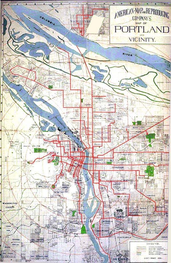
This distribution reflects the way the city grew in its first century, starting at the core and spreading out along streetcar lines. In its spatial form, Portland is a classic “street car city.” Most of our fabric (note this only applies to Portland proper, and not the suburbs and exurbs that later merged to form today’s metropolis) was platted and developed before WWII.

1912Map.jpg

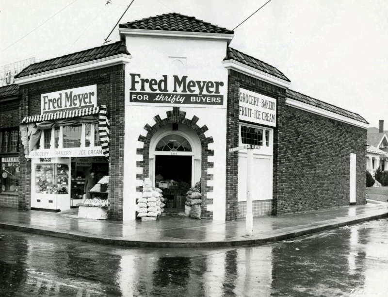
Our distribution of houses and business corridors reflect a pattern where workers commuted via streetcar to the core. In the evening, they’d return home on the streetcar, and get off at the cross street where they lived, stopping to make purchases as they disembarked. For this reason, our arterials, most of which are former streetcar lines, are lined with what is referred to as “street car commercial buildings.

The original Fred Meyer, at SE 36th and Hawthorne. Now home to Bread & Ink Cafe.

The original Fred Meyer, at SE 36th and Hawthorne. Now home to Bread & Ink Cafe.

The commuter would then walk back to his house with an arm full of provisions from Fred Meyer or whatever local merchants lined his commute, to his house. This resulted in a pattern of streetcar lines at intervals, and houses in between. Density ramps down as one moves away from the arterial, then back up again approaching the next arterial.

If we’re going to apply this logic to Portland in a meaningful way, we will need to parse the transect zones a little more finely. We propose adding a second tier to the hierarchy for urban zones. This yields a sequence of T3, T3.5, T4, T4.5, etc.

Our new Portland specific transect hierarchy could look something like this:

T3 = East Portland

T3.5 = Inner neighborhood residential areas between boulevards.

T4 = Streetcar commercial corridors

T4.5 = Primary arterials

We’ll dive deeper into this Portland-specific transect hierarchy in a future post, as it’s a topic deserving of some serious research, especially if we want to use it as the basis of policy recommendations.

As an aside, we will probably want to consider suburban transects in tandem as we plan and manage our growth. Portland and its suburbs are managed by a regional plan, the Metro 2040 plan, which was conceived as a holistic regional growth management plan. To our knowledge, Portland is the only metro in the US with a regional plan that has any real teeth - other cities claim similar but they are merely aspirational documents, not policies. Meanwhile, even within Portland’s city limits, there’s quite a bit of post-war suburbia. Beginning in 1981 Portland annexed East Portland, which had hitherto been the no-man’s land between Portland and Gresham. This area of small farms and orchards urbanized in a piecemeal fashion in the decades immediately following the war and lacks much of the infrastructure or formal coherence of the city west of I-205.

The appeal of the transect is that it is intuitive and familiar - we get it, whether we’ve known a name for it or not. Indeed, the concept is has been around for a very long time and not just in the West even:

ancient_transect.jpg

And like David Byrne, we’ve all observed it as we make our final approach, our seatbacks upright, our tray tables stowed, and all electronic devices switched off.


Building Blocks

The most basic building block of neighborhoods is the lot. These were established when the city was first platted.

The most basic building block of neighborhoods is the lot. These were established when the city was first platted.

In this section of the PDX blog, we’re going to examine the building blocks of urban neighborhoods. This will allow us to articulate what makes neighborhoods great and develop tools and practices that build on this knowledge base. Let’s begin with an exploration of the nested hierarchies that create the sense of scale that allows us to understand how we, with our human bodies, relate to our built environment.

In pre-WWII urban neighborhoods, you can find an easily legible nested hierarchy in the way space is divided. We encounter neighborhoods, which are made up of blocks with a grid (or something approximating one) carving up private land at fairly regular intervals. The blocks or private areas between the streets, are broken in to lots, and sited upon each lot is a building.

BaistMap.JPG

Here we see a page from the 1905 Baist’s Real Estate Atlas of Seattle.  Similar patterns prevailed in most North American cities.

SEA_Aerial.png

Here is the same approximate area today… and below, an area of similar vintage in Portland.

PDX_Aerial.png

In Portland (and most cities that grew during the same era), the standard lot was 50’ x 100’. This is the basic unit of urban form. Sometimes these were subdivided, and in some cases, consolidated to form larger lots.


1.jpg

In a typical condition, these lots are oriented on a block with the short end facing the street/public right of way, and the side abutting similar lots. To borrow a biological metaphor, we can consider the short ends the end grain, and the long sides the side grain, as in wood and lumber. Put together these form a block of a fixed width (two lot depths wide, typically 200’) and an arbitrary length, depending on how many lots were assigned per block in the plat.

2.jpg

This orientation is the most efficient way to arrange lots, as it maximizes the number of lot frontages on a given block. Meanwhile, the fronts of buildings oriented to the street, the city’s most commonly occurring form of public open space. Streets provide the public world (what urban designers like to call “urban rooms”) that provides the setting for all the coming and going of life in these neighborhoods.

6.jpg

In subsequent posts, we will revisit these hierarchies and their implications for how we design our homes and how we use our public spaces.


Millennial in Portland

IMG_0861.JPG

I moved to Portland two years ago, after spending much of my life wishing to live here. I went to high school outside of Grants Pass, and quickly started shifting my way north after graduation.

At 23, I have come to the realization that I have a lot of time on my hands. I have decades ahead of me to plan for. Some predictions say that with advances in technology, it's easy to see much of my generation living well past 100. Hell, my great grandmother made it to 101 living by herself in a cabin down in Wimer, Oregon. That’s a long time, to me, that’s a daunting amount of time to look forward to.


What will it be like?


There’s not a whole lot down in southern Oregon for us anymore. Much of the new economy has ignored rural America, and the mills and logging jobs have become sparse and far between, yet a new generation has come into being with the same needs as the last. Myself, and many others like me have moved with the economy.

Portland doesn’t exist in a vacuum. Our story is not unique, cities are growing all across the globe. Cities are the most conducive and efficient environments for the future of an ever increasing global population and its economic needs, and most major U.S. cities are feeling the pinch as we continue to adjust to this reality. I would argue that of the major cities on the west coast, Portland is the last to really begin feeling it.


Where will we live?


It’s been a long time since its been reasonable for the average person around my age to think too much about home ownership - or long term housing in general. This is emphasized further by the heavy debt that much of us still carry from our college expenses, sometimes well into our 50s. My expectations aren’t high, but when I look around our city, I can’t help but ask myself “where will I be if I’m still here in forty years?” Where will I live?

Portland is not going to stop growing. People are not going to stop moving here. We need to stop fooling ourselves about there being some kind of “bubble” and start understanding that the forces driving growth and development in Portland isn’t Portlandia, doughnuts and big evil developers, but economic and environmental forces that are bigger than all of those things. They are going to keep driving people here well into the future, just like they did me.


What will our stories be?


I went to city council last month to give testimony on the Central City 2035 plan, I didn’t see a lot of people like me there. I pulled back the average age of the room by a few years, but in one way or another, everyone in the council chamber was feeling the pinch. I went to city hall with a few things on my mind; ‘What will this city be for us when we’re still here in forty years? What will our memories be?’ I soon found that others came in with different thoughts; ‘Where has this city been? Will the things we have loved and cherished the most in this city still be there for us in the future?

Many in our community would like to say that these are competing narratives but they shouldn’t be. The idea that they are is rather new, for many my age in the past, the task of finding a place to call home in Portland wasn’t difficult to imagine. Now it seems we’ve run out of room in our built environment but we haven’t run out of us - the people that the growth is for, the people who are looking to build themselves and build up this community in the decades to come just like the ones who came before them did. We have our own unique set of economic and environmental challenges to contend with, and sometimes it feels like those who came before us are trying to be one of them - that’s not how it should be.


What is our future here?


As daunting as it is, I try to imagine what life in Portland will be like in forty years. Sure, there’s a whole world of unpredictability out there, but I still think it’s OK for us to plan it out. What would we do if we get there and realize we didn’t prepare anything?

I see a growing list of challenges that my generation will spend the next several decades managing. We will do it. We will fix many of humanity’s problems and discover many more new ones along the way. We will rise to our challenges, and we will do much of it right here in Portland. Yet everything has been bought up, parceled out, taken, and often going places that aren’t for us. We need new construction to build the future here in Portland, otherwise there will never be anything for us.

We want to build in Portland the things that we will want to see in our city for our entire lifetimes. We want to live in a city that is equitable and that we want to take care of. We want to live in a city where more people can affordably call Portland home from all walks of life.

We need to look to our past for the lessons that will help us build this future. Our past tells us what buildings and lifestyles we have come to love, and what we have come to scorn. The history of Portland in its built environment lays out many different paths for us to move forward with, expanding upon the higher density construction practices that we have loved for decades will help us build the best possible future for the decades to come.

So I want to challenge Portland to imagine itself in forty years, the best possible version of itself, while also taking into consideration many of the difficult challenges we will face between now and then. How will we build for it? More people will be living here then, a lot more. What do we want that to look like? What do we want our lives to be like?

Now we have to plan backwards from there.